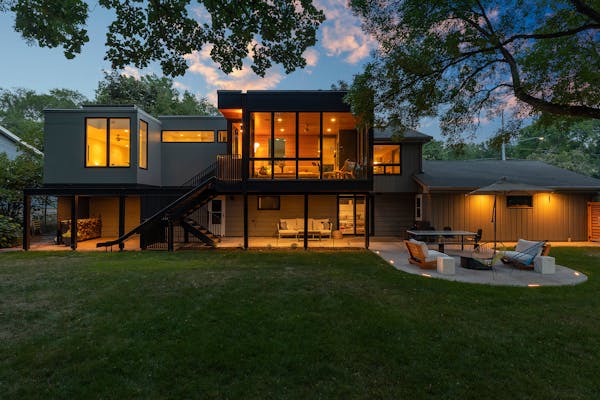
The challenge: Rod and Sue Stombaugh wanted to modernize elements of their traditional Colonial home and make it more functional. The front entry offered no protection from the elements. The main floor spaces were dark and isolated. The kitchen was located in the middle of the house with no windows.
"The house was older and we were trying to decide whether we wanted to move out and look for something else out there," said Rod. "But when we got down to it, we liked the neighborhood."
They set out to open up the floor plan, draw in more natural light and update the overall look of their Mendota Heights home built in 1989.
The designer: Architect Rosemary McMonigal, McMonigal Architects; mcmonigal.com
The solution: McMonigal created a covered porch entrance while giving the facade a modern look. Common areas such as the kitchen, dining area and living room were opened up, which brought more natural light into the house.
Remapping the layout: Key to the project was relocating the kitchen to the front of the home, where the formal dining room had been. While it had plenty of windows, the dining room was closed off to the rest of the house. A more informal dining nook was created off the kitchen and larger windows were installed.
Counter intelligence: The kitchen offers better flow and function. "The previous kitchen was cut up with a few doorways. By the time you interrupt each counter section, you don't have much space," McMonigal said.
"By putting the kitchen in this new section, we had more uninterrupted wall space to work with that gave us more storage and counter space and room for a large island that's also a place for people to gather around."
Wall proxies: Walls were knocked down and replaced with beams and columns, which provides not only structural support, but also classic detailing that gives the home a timeless character.
Widening openings: McMonigal also widened entrances into the living room. "It gives the house this expansiveness," said McMonigal. "It facilitates the feeling of openness between rooms."
The result: Now complete, the Stombaughs are enjoying the new layout of their home, especially when hosting guests. "Before we couldn't have large gatherings because we couldn't all fit in the same room or people would have to be in different little rooms," Rod said. "Before we could maybe fit 10 people but now we can fit 20 to 25 people comfortably."
Everyday Solutions showcases projects by members of the Minnesota chapter of the American Institute of Architects that solve a homeowner's everyday design challenge.

The 5 best things our food writers ate this week

A Minnesota field guide to snow shovels: Which one's best?

Summer Camp Guide: Find your best ones here

Lowertown St. Paul losing another restaurant as Dark Horse announces closing


