With their three boys grown, empty nesters Jeanne and Peter Crain decided to trade their Edina digs for a smaller home near Lake Harriet, one city over.
"We spent all of our time in Minneapolis," Peter said. "We love the density, we love the lakes, we love being close to the bike paths."
Peter, a builder, founder of Trestle Homes and former sculptor and art teacher, knew they wanted to find a teardown and build.
"The parameters in [the existing house] had to be something that really wasn't going to be missed. It didn't have a lot of great architectural bones and it didn't have mature trees on the property," he said. "And then we were looking for something that wasn't the typical lot size."
The Crains gravitated toward the modern homes he often came across in his work. A trip across Europe convinced them that was the way to go.
"It was in that process that we thought we definitely wanted something modern, but not contemporary," he said. "We didn't want white everywhere, but we wanted something super clean. We also wanted some traditional textures."
They also wanted a house that fit the scale and feel of the neighborhood — traditional cottage homes on narrow lots. Function was also important for the Crains, who imagined a house where they could breezily transition between inside and out and have entertaining and flex space for when family visited.
Having worked together on past projects, Peter reached out to PKA Architecture to spearhead the design, while his company would take on the builder and general contracting roles.
"As builders, suppliers and subcontractors in the industry, we all have our ears to the ground," Peter said. And "I've always kind of looked at PKA as one of those firms that values what we bring to the table."
Under two rooflines
For PKA, the task was clear from the beginning: Home in on the best of two worlds.
"Older homes are all segmented, and then we have modern homes that are just completely wide open," designer Gabriel Keller said. "I think we were really interested in creating a sense of place with each space of the home so that you have this difference of scale and this difference of character and quality."
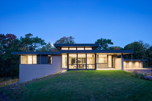
Because Jeanne and Peter needed only a primary bedroom and an office/guest room, they were able to keep the second floor smaller. The result is an L-shaped footprint with two roofs — a traditional gable (cloaked in "discreet" dark gray steel) and a flat roof that runs perpendicular to it.
"Creating a gable form and stone home and then having this more modern gesture as it comes across and creates the flat roof — the green roof — brings the scale down quite a bit," Keller said. "It rides that line between something that's clearly up to today, clearly modern. But it also works with these older cottages that the home is surrounded by."
Sprouting from the flat rooftop is a sedum garden that evokes the charm of a classic European cottagescape while providing a modern sensibility in an urban landscape.
"If you're looking out at a flat roof, it's not fun to look at a bunch of rubber," Keller said. "[Using it in this way] is much more interesting."
They chose succulents, particularly sedum, for the plant's durability and ability to grow well in Midwest climes.
"You're putting vegetation on a flat surface that is exposed to the sun all day and during the summer it's kind of an unforgiving environment, but the sedum does amazing," Peter said. "We don't have a built-in sprinkler or irrigation system. Occasionally, during a drought, I'll throw a sprinkler on."
Inside moves
Inside, both roof forms frame the entire lower level, which includes a media room, game room, third bedroom and bathroom. On the main floor, the gabled roof houses the kitchen, a mudroom, the stairway and the alley-entrance garage. Meanwhile, the flat roof encapsulates the front porch, foyer, dining room and living room. Just past gathering spaces, a heated and screened outdoor dining and seating area opens to the back courtyard.
It's one of several ways PKA created the inside-out connection that Jeanne and Peter were looking for. Variegated brick on the exterior carries into interior spaces. Floor-to-ceiling windows, sliding glass doors and a skylight further blur the lines between interior and exterior.
"[The skylight] really opens the volume up," Keller said. "And then we have lower-height spaces and screens that divide some of the other spaces and light fixtures that bring that to scale. And so all of these are kind of tricks of the trade that allow us to create the character that we're after."
Since its completion, the project has gained recognition, including being named a Star Tribune/American Institute of Architects Minnesota Home of the Month, which recognizes top residential designs.
The accolades have extra meaning for those involved because project manager and architect Ted Martin died just as the final landscaping touches were being put on. "He was an integral part of this project, and it's really satisfying to see its completion that shows the world the attention to detail that he was known for," Keller said.
PKA's Melinda Nelson said this project is an example of Martin's legacy and the stamp he left on the Minnesota architecture community. "When he talked about his work he was passionate about, what he called Minnesota modernism, which to him was creating a modern home that could withstand our swings in temperature and works for day-to-day living," she said. "This home is Minnesota modernism at its finest."
Fall colors
These days, the sedum, usually an array of colors during the summer, has gotten its fall stripes.
"We call it a green roof, but it's really a maroon roof in the fall. It just turns this maroon that is stunningly beautiful," Peter said.
Jeanne and Peter log the most time on the screen porch with a heated ceiling, fireplace, dining table and lounge area, which feels like an extension of both the house and the backyard. "We're out here April through December," Peter said.
As Thanksgiving nears, they'll host family, just as they did last year.
"Last year we had 28 family members for dinner, and we're probably going to exceed that this year," Peter said. "And no one feels cramped. There's spaces for the kids, there's spaces for the adults, there's spaces to get away from the rush of the crowd. … It performs perfectly."
About this project
Designing firm: PKA Architecture.
Project team: Founding principal/designer Gabriel Keller, Assoc. AIA; project architect Ted Martin, AIA, and Brent Nelson, AIA; Sarah St. Louis, Assoc. AIA.
Project partners: General contractor, Trestle Homes; engineering, ALIGN Structural; interior design, InUnison Design; landscape design, TVL Studio.

The 5 best things our food writers ate this week

A Minnesota field guide to snow shovels: Which one's best?

Summer Camp Guide: Find your best ones here

Lowertown St. Paul losing another restaurant as Dark Horse announces closing


