Photographer Rod Komis fell in love with his picture-perfect neighborhood long before he bought a house there.
"I always liked the street," he said, a quiet cul-de-sac in a pocket of winding roads and mature trees that he first discovered in his early 20s. "It was the most beautiful road I'd seen."
Years later when he and his wife, Michele, were hunting for their next house, he saw a listing in Deephaven.
"I didn't want to live that far out, but ended up looking at it," he said. The property turned out to be on the street he had admired long ago.
So the Komises bought the house, a midcentury split-level rambler.
The couple loved their neighborhood, and their lot, which was deep and wooded, tapering back to a pond. But the house, which had been added onto twice, had some awkward features.
"The front door was in the wrong spot," said Rod. "We never used it." The split-level floor plan meant you entered the front door and faced two half-flights of stairs — one up to the living room and one down to the kitchen and family room, which were on the walkout lower level.
Visitors often walked around the garage to the back door. "It felt like the front door should go somewhere else," Rod said.
Their kitchen had an island for casual dining, but there was no dining room. They also needed a new garage.
Rather than tackling the house piecemeal, the couple decided to wait "until we could save enough to redesign it," said Rod. "It was such a big undertaking."
Finally, when their two kids reached their teens, the couple decided it was now or never.
"We had a pretty good idea of what we wanted in a layout," said Rod, who had overseen several home projects at their previous house. But this posed a bigger challenge. "I didn't want to mess it up," he said. "I didn't want it to feel added on to yet again."
So they hired architect Todd Hansen, Albertsson Hansen Architecture, to reimagine their home.
Better version of itself
"They wanted it to be a clean, fresh version of itself," said Hansen. "The challenge was to take a house that had a tired, dark feel and make it a light-filled pleasant place to be."
The walkout lower level, in particular, could be a lot more inviting than it was. "It definitely felt like a basement," Hansen said. And with such a pretty wooded setting, "it made sense to focus on the view."
To bring out the home's potential, Hansen designed two additions. One created space for a light-filled front entry and mudroom on the same level as the kitchen and family room; the other addition extended the kitchen, adding space for a dining room. The awkward front door was eliminated.
"The front door is so much more welcoming," said Rod. "There's no doubt where to go now. It always bugged me. My mind is now at ease when I go to my own house."
New larger double-hung windows brought in light and updated the home's look. "They fit the volumes of the house," said Hansen.
In the upper-level living room, new windows capture the wooded views. "We can see the backyard now," said Rod. Removing a closet freed up space to turn the room into a family/music room that can accommodate a TV and the family piano. "Now we use the upstairs room a lot more."
An attached three-car garage, connected to the new entry, replaced a detached two-car garage.
A new sunken backyard patio is larger and sunnier than their old patio. There's a serpentine stone wall and a recessed spot for the grill. "You can't see it from inside the house," said Hansen. "It's very private."
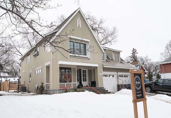
The home's exterior was freshened up with new fiber-cement siding.
Inside the walkout lower level, removal of a wall created a better circulation pattern. The existing brick fireplace was painted white with a new hearth. "It feels free-floating," said Hansen. "One of the triumphs was to take a house that had basement main living spaces and turn that into a plus."
The project expands
The Komises hadn't initially intended for the project to include a complete kitchen makeover. But the newly opened floor plan downstairs would make the 1970s-era kitchen much more visible.
"Once they saw it was all going to be seen they wanted to bring it up to the same consistent feel," said Hansen.
As the project scope expanded, the Komises wondered if they'd be better off finding another house. "After we saw the cost, we considered moving," Rod said. "But we can't find the same lot and street that we have here."
So they forged ahead, new kitchen included.
There's a new pantry on one wall but most of the storage is in the lower cabinets. "Upper cabinets would start to close the space down," said Hansen. "Floating shelves were a nice way to extend the idea of upper cabinets." Modern hardware with elongated pulls echoes the length of the room.
The countertops are dark granite, while the island is topped with walnut, the same wood used for the open shelving and the new stair rail.
Some of the home's original features were repeated in the new sections to unify the home. The whitewashed wood ceiling treatment in the kitchen, for example, was extended into the new dining room and duplicated in the new entry.
The project was "a fun opportunity to work with a newer house than we often end up remodeling," said Hansen. "This era of house is becoming more of the work we do. They're ready."
Rod is glad they chose to work with a professional architect. "It was worth every dollar," he said. "Todd was able to make it fit together inside and outside." Without his expertise, "it wouldn't have felt nearly as nice."
The Komises also hired Hansen to manage the project. "Todd worked with the builder to make sure it was done right. It made the project so much less stressful. He also came up with ways we could save money and still get what we wanted."
The Komises have not regretted their decision to invest in their home. "We're so happy to have stayed," Rod said. "It feels really well designed — like a new house — without tearing down and starting over."
Kim Palmer • 612-673-4784
ABOUT THIS PROJECT
What: Remodeling a midcentury split-level home in Deephaven.
Size: Two additions increased the main-floor square footage from 1,440 to 1,815 square feet; existing space also was updated. Detached two-car garage was replaced by attached three-car garage.
Design: Architects Todd Hansen and Amanda Chial, Albertsson Hansen Architecture.
Landscaping: W Landscaping

The 5 best things our food writers ate this week

A Minnesota field guide to snow shovels: Which one's best?

Summer Camp Guide: Find your best ones here

Lowertown St. Paul losing another restaurant as Dark Horse announces closing

