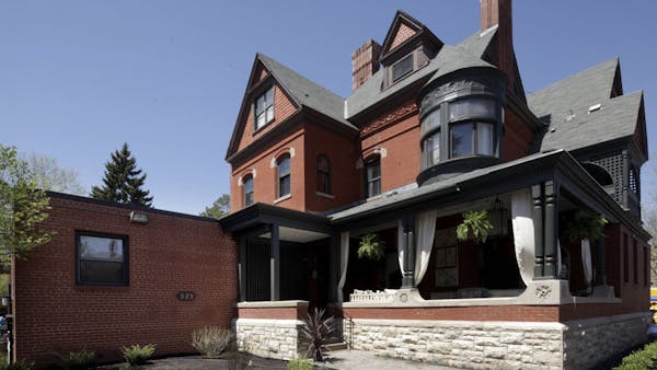
Love it or loathe it, Victorian-era decor is not known for restraint.
Ornamentation was good. More ornamentation was better.
But even those who appreciate swirls and swags and fussy furniture don't live formal lives today.
Designers kept this in mind when transforming this year's ASID showcase home, an 1882 Queen Anne Victorian in St. Paul's historic Cathedral Hill neighborhood.
"Traditional Victorian had a lot of layers and patterns — it can feel heavy and somber," said Kimberly Herrick, showcase chairwoman.
And even though the front of the house will soon open as a B&B, where guests expect a bit of bygone elegance and pageantry, the new owners are young entrepreneurs with modern tastes and a busy lifestyle, juggling three small businesses plus three small children.
"They have a lot of vitality," Herrick said. "They wanted a B&B that reflected history, but also a more modern sensibility."
Homeowners Whitney and Andy Blessing like to stay in B&Bs when they travel, Whitney said. "We've seen it done in a cluttered way. We didn't want to fill the house with antiques. We wanted it to be a little different."
Designers responded with an approach they're calling Modern Victorian, which Herrick describes as "classic and traditional, but tempered with cleaner lines and colors. Classic, to me," she added, "is looking to the past for shapes and forms but reinterpreting them."
Andy Blessing, whose A-Squared Design/Build/Remodel served as general contractor for the makeover, was amazed at how many of the home's original architectural features survived its years as a nursing home and boarding school, among other uses. Those features are better showcased when they're not obscured under layers of decor, he noted.
Victorians favored rich, saturated colors, but the hues in the showcase home are softer and more contemporary: a lot of grays and creams, with punches of yellow, aqua and a terra cotta that takes its cue from the home's original bricks.
The palette was inspired by photos that Whitney had collected online, but other than that, she delegated most of the design details on the B&B side of the house. There, "the designers had a lot of creative liberty," she said. "We had already divorced ourselves from those rooms."
The Blessings were much more invested in the rooms they will inhabit, at the back of the house. "On our side, we wanted to create personal spaces," Whitney said.
The B&B side of the house, which will operate as the St. Paul Bed & Breakfast, still boasts its original woodwork, quarter-sawn oak floors and other 19th-century details, such as ornate ceiling plaster work and leaded-glass windows.
But there are also modern touches. The Farrington Suite, for example, one of four that will host guests, has a new accessible bathroom with a transfer bench in the shower and a vanity that can accommodate a wheelchair.
Look closely in the Storybook Suite, named for its fireplace that's adorned with colorful handpainted tiles depicting nursery rhymes. You'll see one new tile, dated 2013, with painted likenesses of the Blessings' three children. It replaces a broken tile, the only one that didn't survive from the 1880s.
That gentle touch has been the guiding philosophy for the makeover, according to Herrick. "One of the things the Blessings are committed to is that if it's not broken, don't fix it," she said. "They love the idiosyncracies of the house. It's about honoring the past and breathing new life into it."

Want to share info with the Star Tribune? How to do it securely

A Minnesota field guide to snow shovels: Which one's best?
Sign up for Star Tribune newsletters


