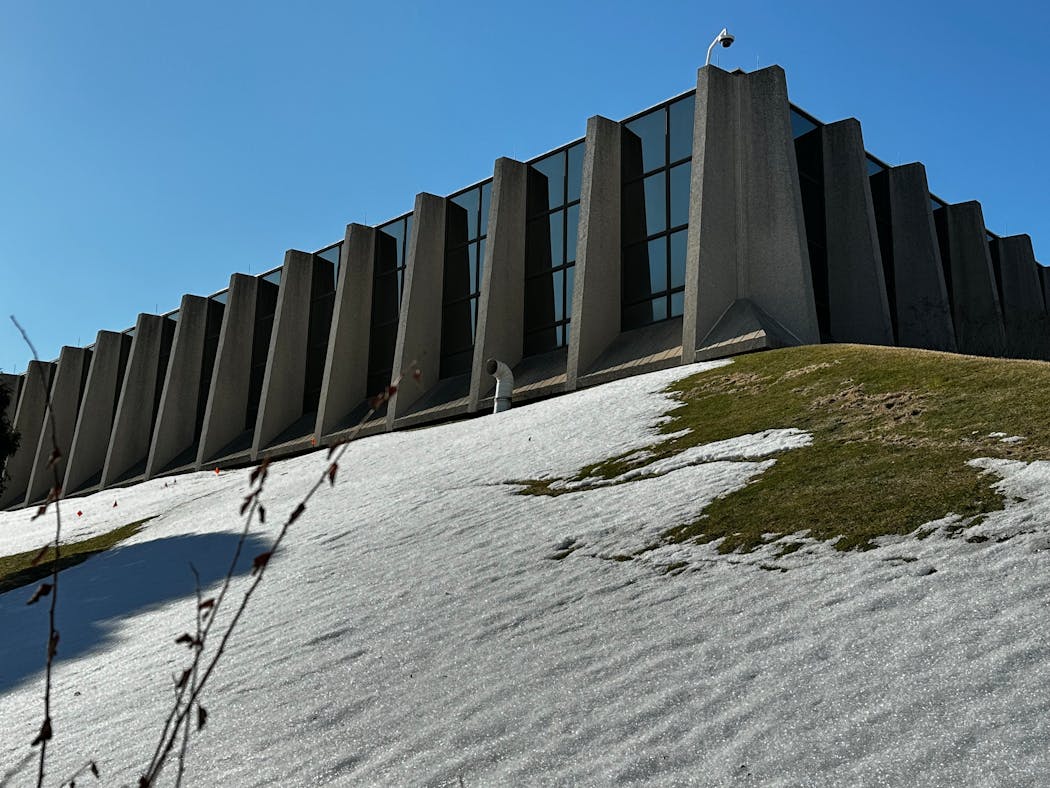
Macy's Southdale Furniture and Mattress Gallery in Edina (aka the Black Hole of France Avenue) is not long for this world. Enclave, a North Dakota developer, has announced plans to demolish the 45-year old structure, and build offices and housing on the site.
This raises an important question: How best to dance on its grave?
But the building — an example of a 1970s "earth-sheltered" structure — will likely have its defenders, so let me explain why I think the building is ugly, how it came to be and why few people will be sad to see it go.
The how
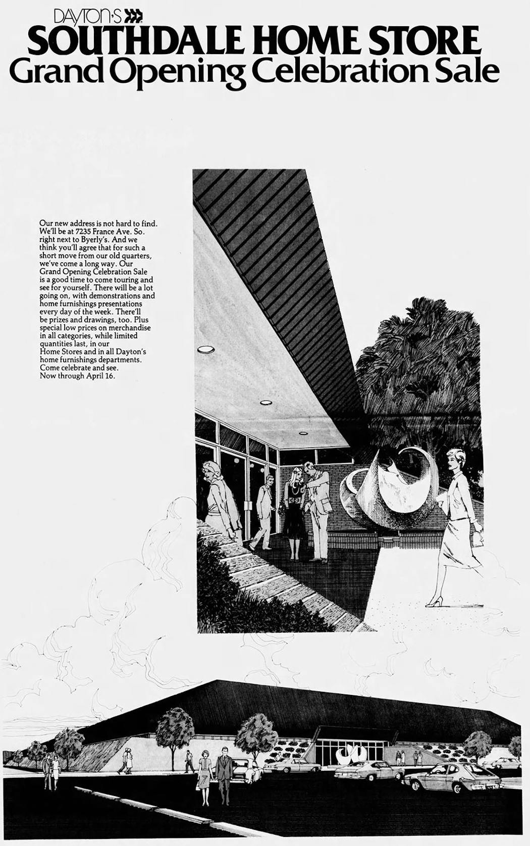
The Dayton's Home Store, as it was originally known, opened in April of 1978. The company took out an advertising section in the Star Tribune, with a lyrical introduction to the new vision:
"We at Dayton's had a dream store in mind, one that was as unique and exciting as this growing area of the community ... Architectural plans resulted in a structure that is not only striking, but down-to-earth practical. Literally. By building the store right into the landscape, energy is conserved by the best insulation of all: solid ground."
The two-story structure was sunk into the fertile soil of Edina, and more dirt was heaped around its angled walls. Even though the entrance was marked by a piece of abstract sculpture, the exterior of the building was intimidating.
Inside, it wasn't bad. It was modern in a late '70s way. It was not overly endowed with natural light, so the patterns on the fabric didn't fade.
The why
Earth shelters were popular among some residential and commercial architects at the time. Dirt insulation meant the building wouldn't cost so much to heat, and that counted in an era of high oil prices (gas in 1978, adjusted for inflation, was more than $4 a gallon) and fears of imminent, permanent scarcity.
The style had been around for a while. After all, people had been heaping earth around cottages for centuries. But now there was a financial incentive to try something new in office and retail construction, with the added benefit of an ecological gloss.
Mix in some futurists like Paolo Soleri and other visionaries who liked the idea of underground cities, and you had a new design paradigm.
Several earth-sheltered structures popped up (or down, if you wish) in the Twin Cities. Williamson Hall (1977), the bookstore at the University of Minnesota, is almost entirely underground.
The former Walker Library in Uptown (1981-2013) was also underground. Wikipedia notes that it "was not easily visible," which happens when you bury something, and "had problems with water seepage," which is just great when you have a lot of paper.
Perhaps the most notorious example was Control Data's St. Paul building at 474 Concordia Av. It collapsed in 1985, killing one person. Another of the company's earth-sheltered structures still stands on 5th Street by U.S. Bank Stadium in Minneapolis, looking like a temple overgrown by a well-behaved jungle.
Control Data also built one on the edge of downtown, on 9th Street. It has a fence to keep people from sledding down the side, which might be one of the few things the buildings had going for them.
If you want to live in one of these structures, the option still exists. The Seward Townhomes on S. 9th Street between 24th and 25th Avenues, right on the lip of I-94, still stand, the sides heaped with soil, looking like a home for hobbits who work at the U.
The positives
Is it possible to say something nice about the style? Sure. At least it was trying to adapt to an energy-scarce future instead of building walls of glass that required lots of air conditioning. (Though it should be noted that the Dayton's store had a vast parking lot between it and France Avenue, which presumed people would still drive to the store in years to come.)
But the future was not energy-scarce at all. Within 10 years, earth-sheltered buildings would look almost sullen and defensive, as welcoming as bomb shelters. And the fledgling style, which tended to be expensive to build, never really caught on. New ideas to improve energy efficiency phased out earth-sheltered commercial buildings almost entirely.
The buildings that rise in place of Macy's Furniture Gallery store will most likely fit in better with the other buildings on France Avenue. And here's a real plus in the proposal: The buildings will come up to the street, rather than being tucked behind a sea of parking spaces.
Yes, a big piece of our architectural legacy is about to be removed. But for once it's not hard to say good riddance.

Minnesotans find beautiful views, food and fun on trip to New Orleans via train

Black Sheep pizza sued for $200K back rent at closed south Minneapolis shop
Bake like it's 1999 with this recipe for Prince's Favorite Cookie

What's that redder-than-red bird?


![Minneapolis skyline including IDS Center, Capella Tower, Ameriprise, Foshay Tower, AT&T Tower, Friday, April 15, 2022, Minneapolis, ] GLEN STUBBE](https://arc.stimg.co/startribunemedia/OJPBLW7ASDYLAVSV2X2GSAOALM.jpg?w=600&h=600&auto=format%2Ccompress&cs=tinysrgb)