"Dark stained wood in the kitchen is making a comeback. You heard it here first," laughed designer Heather Peterson referring to her clients, Cindy Poehls and Drew Johnson's decision to go with stained walnut in their new kitchen and mudroom.
The kitchen revamp was part of a major project to renovate and restore their Minnehaha Parkway house in Minneapolis after Poehls and Johnson won it in a foreclosure auction in 2018.
The couple were up for a project, especially after looking at many homes in the area where the character had been diminished by clunky remodeling efforts. Johnson grew up in the neighborhood and both have an affinity for old houses. Except for the 1980s-era kitchen, most of the house had its original light fixtures, woodwork, crown moldings and other architectural details intact.
Plus they already lived in the neighborhood, were familiar with the stately 1921 Federal-style home with the big front yard and — as timing would have it — were looking for a larger house.
But first they had to secure the house, with a nerve-wracking online auction experience.
"We grabbed a glass of wine, sat at the computer, and entered our bid. We got outbid three or four times, and then our last bid just sat there and the auction ended," Poehls recalled. "We looked at each other and said, 'I think we just got the house.'"
Ph-ph-ph-phases
Early on, they decided to restore the house in phases — a road map that made the scope less daunting. This approach also helped with budgeting and allowed the family to get breaks from construction.
"We could go slow, live here and really figure out what was best for us and the house," said Poehls.
The first phase was the less exciting business of installing a central air-conditioning system and refinishing the woodwork in the main living spaces. For the next phase, they knew it would be necessary to gut the kitchen and add a bump-out to remedy a cramped back entry.
Poehls had a good idea of what she wanted for the kitchen thanks to a photo from Instagram (designer Jessica Helgerson) and worked with Peterson of Heather Peterson Design, architect Jean Rehkamp of Rehkamp Larson Architects, and builder Joel Johnson of JS Johnson and Associates to figure out how to get there.
Extending the kitchen to include a graceful breakfast room, which Rehkamp suggested and Peterson promoted, wasn't a foregone conclusion because it would require a slightly larger bump-out and be more expensive, but ultimately Poehls and Johnson were persuaded.
"With older, more traditional homes, symmetry and proportion are key to making the new spaces feel old," said Rehkamp. "The windows in the breakfast room match the double-hung windows in the front of the house, so there's continuity."
The new mudroom and powder room are located a few steps down from the breakfast room — connected but separate.
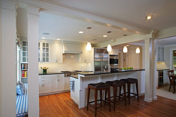
Poehls' first design splurge for the kitchen was a blue Lacanche range — a focal point from her inspiration photo, which also included dark cabinets and a black floor. "That [photo] was Cindy's evidence that this could work," Peterson said. "Obviously, the kitchen isn't original — there wouldn't have been an island in the 1920s — but by using the same wood as the rest of the house, instead of white or another color that's popular right now, we chose to date the kitchen to the original versus a specific moment in time."
Repeating woodwork and other details found in other parts of the house and bringing it into the kitchen — brackets on the island that match the trim of the staircase, a Tudor arch on the range hood and tall cabinets — are subtle but important touches Rehkamp brought to the design to keep the style consistent.
Goldilocks floor
Choosing the floor was a little tricky.
They settled fairly quickly on black (Belgian bluestone) and white-honed tile in a checkerboard pattern for the mudroom floor. But the kitchen took longer, even though they knew they wanted a dark hexagon tile.
"The shape is sort of casual, so the glaze needed to be elegant enough to stand up to the woodwork," said Peterson, who likened the search to the goldilocks tale — too shiny, too matte, and, finally, just right — a handmade ceramic tile with a tiny bit of sparkle.
One happy discovery was that the house had all its original light fixtures, which Poehls had restored by Lightworks in northeast Minneapolis. For the new fixtures, Peterson worked with Lightworks to create custom designs using vintage shades that are more streamlined but still feel historical.
"Everyone put so much thought into every piece of this and we wouldn't change a thing," said Poehls, as the couple enter the project's last phase, which includes updating the facade, landscaping and a new garage.
Peterson is glad her clients are happy with the project, a satisfying collaboration of homeowner, designer, architect and builder.
"People never regret the things they invest in, even if it felt like a big deal at the time," Peterson said. "They regret the things they didn't invest in and should have. These guys won't have those regrets."
Laurie Junker is a Twin Cities-based freelance writer specializing in home design and architecture.

The 5 best things our food writers ate this week

A Minnesota field guide to snow shovels: Which one's best?

Summer Camp Guide: Find your best ones here

Lowertown St. Paul losing another restaurant as Dark Horse announces closing
