White kitchens have ruled the roost for a long time and while they aren't going anywhere, some homeowners are dipping their toes into more colorful waters. Others are diving headfirst and going all in.
Whether it's residual boredom from the pandemic, a backlash to minimalism or a logical extension of the entertainment kitchen, social media are full of chromatic inspiration from tiles to appliances to fixtures (purple kitchen faucets, anyone?).
"I've seen a huge increase in clients wanting more color in their kitchens," said Twin Cities designer and co-founder of Fox Homes Heather Fox. "As we all spent more time in our homes during the pandemic, people realized how home should reflect and nurture them rather than just keeping everything neutral and safe."
Ashley Mock, MN National Kitchen and Bath Association (NKBA) chapter president, agreed. "Color has been an ongoing trend in kitchens for the past few years. At the Kitchen and Bath Industry Show [in Las Vegas] a few weeks ago, it was evident that color is still at the forefront of design for homeowners who value boldness," she said.
From pale pinks to a mint green "Gucci Kitchen," here are ways in which local designers and homeowners are taking the plunge.
In the pink
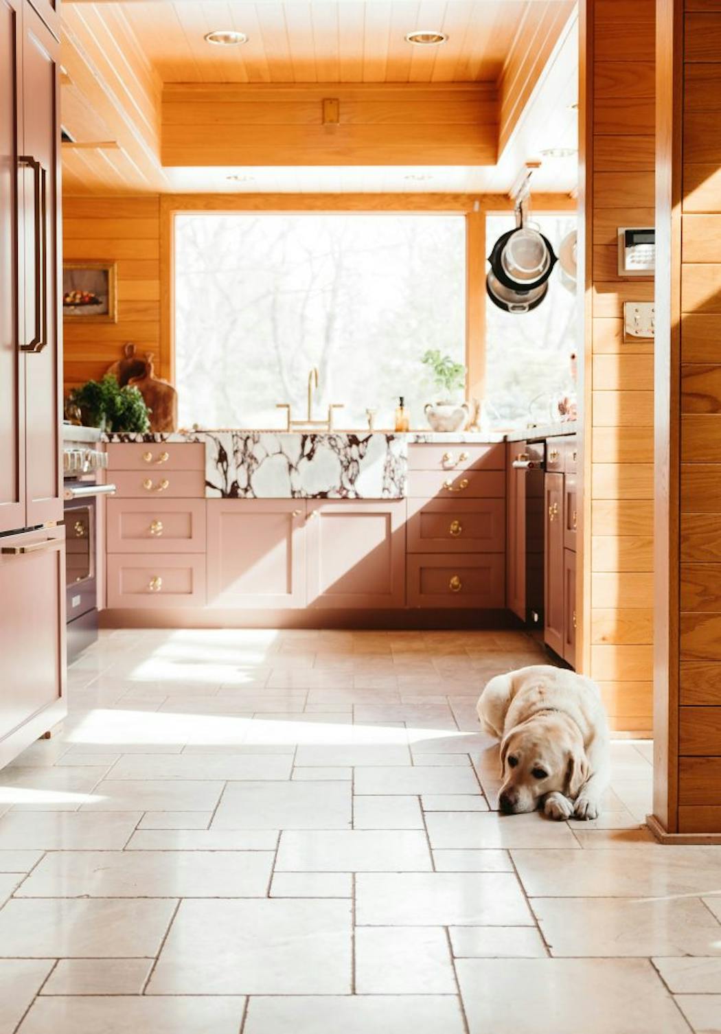
Kate Arends Peters' latest kitchen remodel is her most colorful and confident to date. Four years ago, the founder of the popular Wit & Delight blog moved into a 1956 rambler in St. Paul's Merriam Park neighborhood with her husband and two kids. The house already had a lot of color, including a bright coral living room and yellow study, which Arends Peters planned to paint white.
But after living with the vibrant rooms for a few months, she had an epiphany. The color made her feel good. "That changed my perspective on what color can bring to a space," she said.
So, when it came time to update the kitchen, Arends Peters followed her instincts and her heart, juxtaposing the existing red oak paneling with pink cabinetry, a blue range, extroverted Calacatta Viola marble countertops and dressy furniture style pulls.
She completed the space with Instagram favorite Farrow and Ball Hague Blue for the island and coffee bar. "It's beautiful," Arends Peters says. "With this one, I let what I like take the lead."
Gucci kitchen
"People are embracing individualism right now and color can help them make their homes look and feel how they want them to," Prospect Refuge Designer Victoria Sass said.
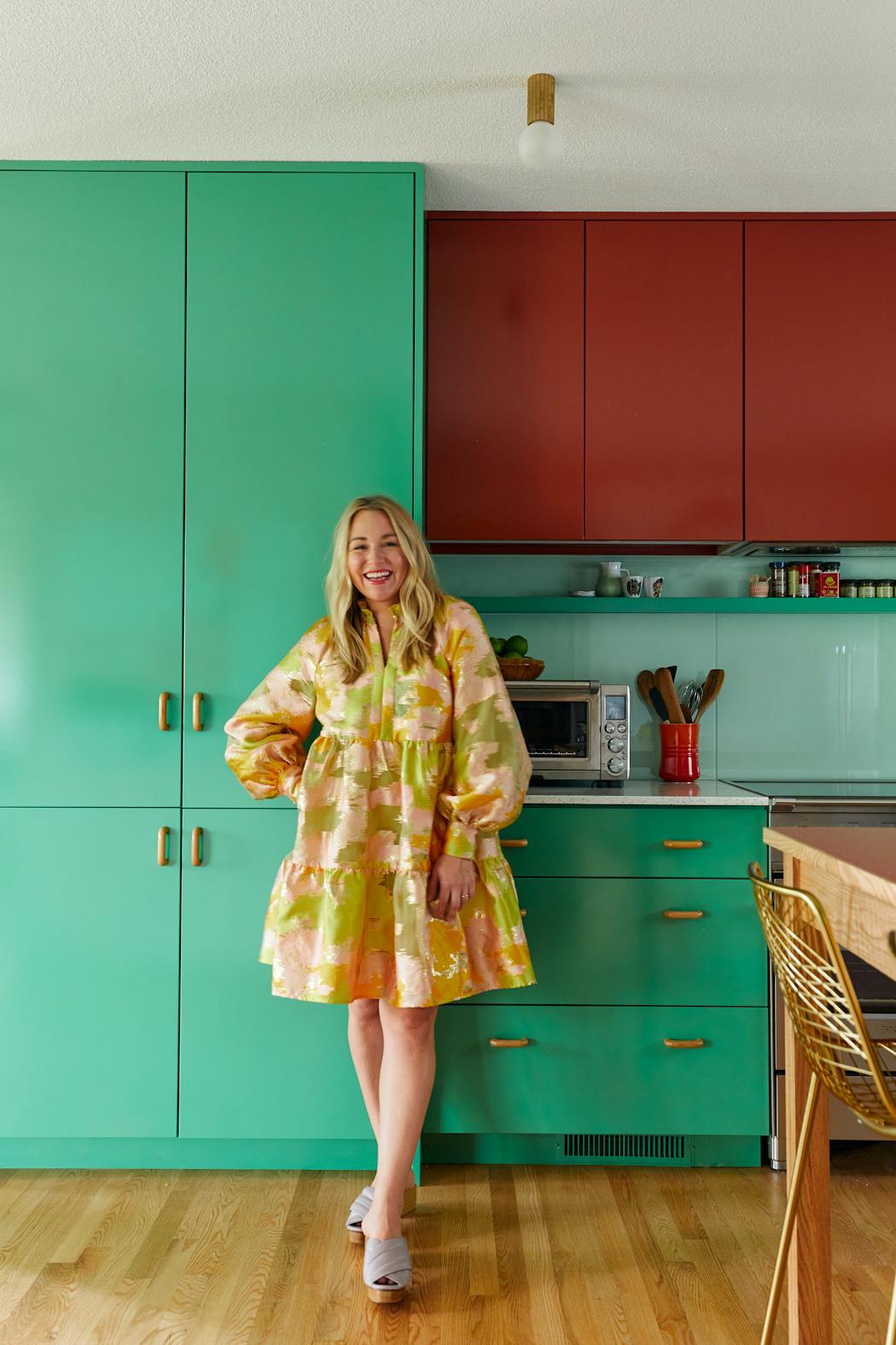
This was certainly true for Minneapolis residents Andrea Ravich and Matthew Arriola, who hired Sass to transform the white kitchen of their 1964 Bryn Mawr home into a space that better reflects their lifestyle and taste. "My Pinterest board was all over the place. I had home interiors, art, fashion and music. Somehow, Victoria was able to make sense of it all," Ravich said.
Knowing how much Ravich loved Gucci, Sass checked out their collections and found inspiration in the 2020 Gucci Spring Summer runway show — a kaleidoscope of mint, red, lavender and gold.
"Fashion can be a good resource for how to combine colors," Sass explained.
She bathed the kitchen cabinets and backsplash in shades of red and green (a nod to the avocado greens and terra cottas that were popular when the home was built) to create a sophisticated color-blocked effect. Then, they added white countertops and wood accents to give the eyes a place to rest.
"Looking at beautiful, eclectic things makes me feel calm, content and really happy," Ravich said."Our kitchen is certainly that."
Gee, I'm a tree (house)
For a bluff-top home on Medicine Lake in Plymouth, Heather Fox let a geometric tile that her clients fell in love with lead the way. She plucked blue and peach from the tile for the cabinets and range hood — using a matte finish for a quieter effect — and, in the adjacent dining nook, picked up yellow on the banquette.
The style feels suitable for a house from the 1960s era, when interiors were more flamboyant. "But older homes had color, too, often more muted tones like sage or burgundy," Fox added. "So, there's no reason everyone can't bring more color into their homes, whatever the age."
Easy being green
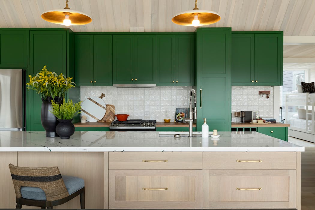
The verdant green in a Luck, Wis., kitchen is called Arugula Green (Benjamin Moore), which is fitting for a lakeside retreat where extended family members gather to enjoy nature, each other and, quite possibly, fresh summer salads.
Gabriela LaBoy, senior designer at Martha O'Hara Interiors, said the color hit a chord with the owner, who lives full-time in Chile. "South America is big with color. Here in the Midwest, it helps warm up the space, which is especially nice during long winters."
Step back in time
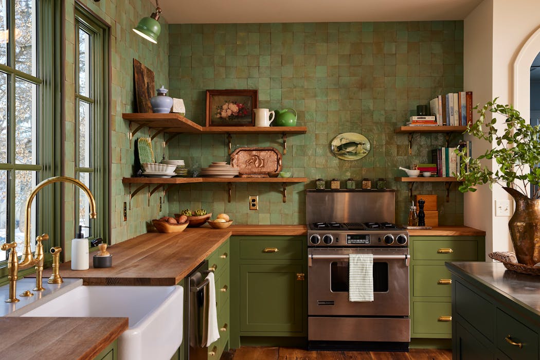
Another take on green that proves the color's versatility is a 1922 Minneapolis house where the longtime owners wanted an Old World, English country look and feel for the heart of their home.
Mark Peterson, lead designer and owner of the design-build firm MA Peterson, said the theme and color were an outgrowth of many conversations with interior designer Wendy Boyer. "Lots of colors could work, such as ochres or reds, but the homeowners liked this green," he said.
With evocative details like walls of slightly irregular handmade tiles, wood and zinc countertops and period-appropriate lighting, the kitchen has the warmth and historic feel the clients desired, along with modern amenities.
The kitchen stirs up a surprising nostalgia, according to Peterson. "It kind of does something to you."
Laurie Junker is a Twin Cities-based freelance writer specializing in home design and architecture.
Related

Get our Floored newsletter

The 5 best things our food writers ate this week

A Minnesota field guide to snow shovels: Which one's best?

Summer Camp Guide: Find your best ones here

Lowertown St. Paul losing another restaurant as Dark Horse announces closing
