Steve Schilling and Diane Rafats loved their Minneapolis neighborhood and the house they lived in for more than 30 years. So when Schilling retired recently, they thought about moving, but decided instead to stay put.
Staying, however, came with conditions. Their aged and worn Uptown abode built in the early 1900s was in a funk. Both the kitchen and second-floor bathroom needed makeovers.
First up was the bathroom, which showed design elements from a mix of eras. Schilling and Rafats decided they wanted to return it to a classic look.
"I would say it was half 1950s, half 1970s," Schilling said. "There was pink tile, and everything in there was bulky. I wanted to throw it back a little in the time and space of when the house was built."
The team: Minneapolis' HyR Building design and build.
The challenge: In addition to gutting the bathroom, updating the plumbing and swapping out the tub, toilet, sink, flooring and fixtures, the room had water damage, sloping floors and an uneven ceiling.
At 5 by 6 feet, it was the smallest bathroom HyR had redesigned, said president John Shannon. "There wasn't any room to push or pull."
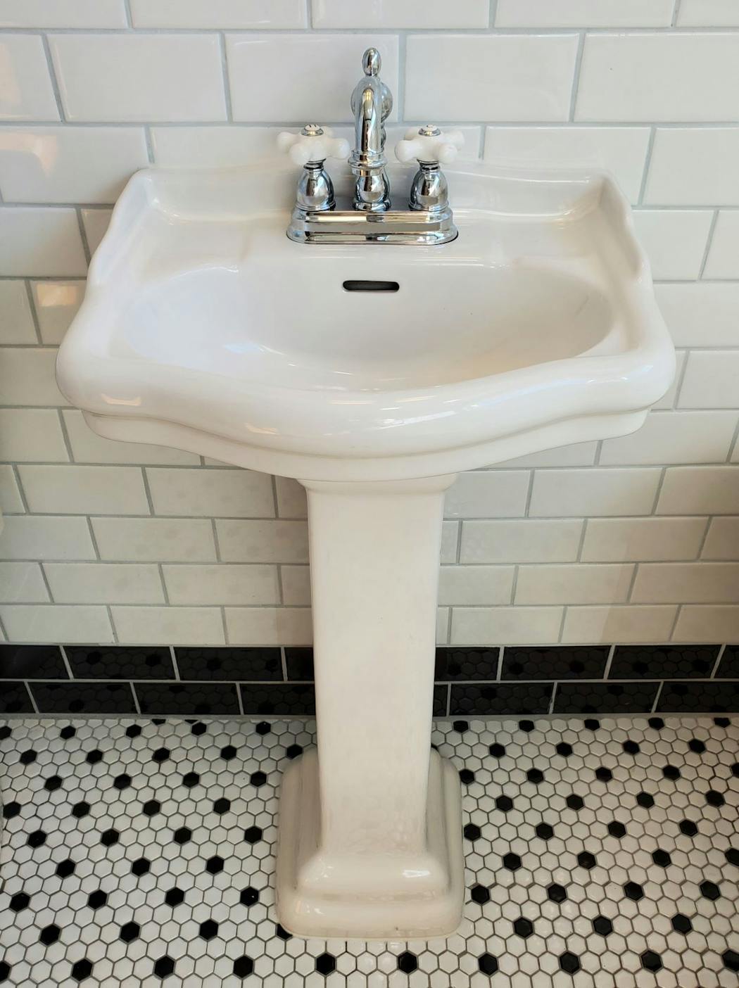
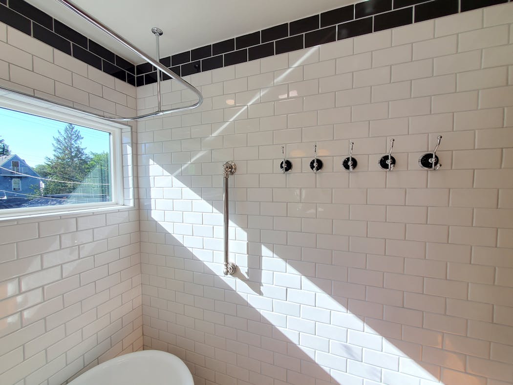
The solution: In addition to leveling the floor and updating the skeleton, design elements were brought in to make the room feel classic and more spacious. The walls were clad in classic white subway-style tile with black trim and chrome accents.
It has legs: They also traded the chunky vanity for a slender pedestal sink and moved the under-sink storage to a new wall cabinet above the toilet. The built-in tub was changed out for a leggier, freestanding clawfoot tub that offered a more timeless style.
"It gives you the illusion of space in a very small room," Schilling said. "That's one of the things I'm really enjoying, how it makes the room feel bigger."
Uninterrupted light: Letting in more light also made the room feel more spacious. Over the tub, double-hung windows were replaced with a picture window placed high enough to offer privacy.
"It starts about shoulder height so people can't see in," Schilling said. "And it gets a ton of natural light. The whole width of the bathroom is a window."
The result: Schilling and Rafats discovered that sometimes the best way to update a space is to turn back the clock.
"They did a great job. Compared to what it was aesthetically, it's much more pleasing," Schilling said. "They went backward in time and it fits the house perfectly."
Everyday Solutions showcases projects by members of the Minnesota chapter of the American Institute of Architects that solve a homeowner's everyday design challenge.

The 5 best things our food writers ate this week

A Minnesota field guide to snow shovels: Which one's best?

Summer Camp Guide: Find your best ones here

Lowertown St. Paul losing another restaurant as Dark Horse announces closing
