A salute, this July 4th, to flags.
To flags and the people who care enough to make bad flags better.
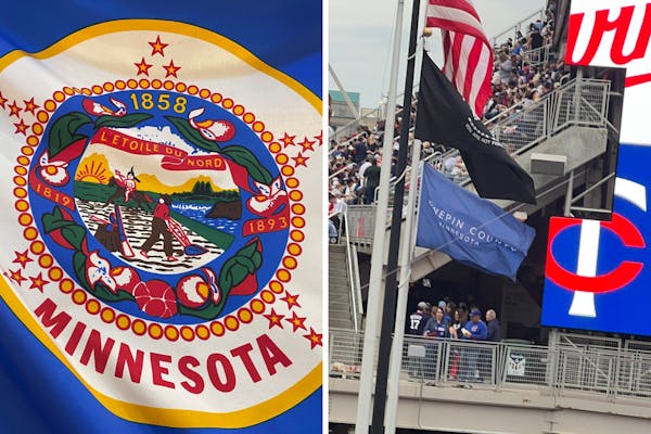
Which brings us to the Hennepin County flag, waving proudly over the heads of baffled Twins fans one beautiful June day in Minneapolis.
The flag was a plain field of blue, with nothing on it but the words "Hennepin County, Minnesota" writ large.
A good flag is memorable. A good flag is meaningful. A good flag is simple. A good flag tells you where you are at a glance.
This flag checks at least one of those boxes. Not bad for a placeholder that's been flying over our heads for a year, virtually unnoticed.
"It is boring," said Hennepin County Commissioner Marion Greene, who as board chair last year asked staff to find something the county could proudly run up a flagpole. "But one thing I like is that it is boring, for now."
For now, the county just needs a flag to serve as a way-finder. Something that signals that the building you're about to enter — the health services center, the solid waste incinerator, the library — is a county service, not the city's.
Boring beats the alternative, in this case. The old county flag was just the Minnesota flag with "Hennepin County" written across it. Better a boring flag than a knockoff of a state flag so racist and cluttered that the state plans to redesign it by the end of this year.
"A flag is like a coat of arms. It represents the entity of Minnesota," said state Sen. Mary Kunesh, DFL-New Brighton, who authored the successful Senate legislation to redesign the state flag. "When so many people don't see themselves represented in that flag, or misrepresented in that flag, it doesn't create the kind of unity, the kind of pride we'd like to have in our state."
Kunesh will serve on the 13-member board tasked with finding us a better flag. The job will likely involve sifting through hundreds of thousands of flag designs Minnesotans will be able to submit during the public comment period later this year.
The current state flag features an Indian, riding out of the picture. Now Kunesh, whose Lakota ancestors were driven from their lands, will help choose something better.
Designing a new flag could be a joyful experience for this state. Nothing gets you to focus on what you love about a place like trying to design something to represent it.
If the flag is bad, people might not even notice it's there. If the flag is good, people fly it over their homes and buy flag-themed mugs and tattoo it on their biceps. You know a good flag when you see one.
Which makes it puzzling that America is home to so many bad flags.
Minnesota's flag is almost indistinguishable from 20 other flags that look just like it until you get close enough to see the cruelty. You're probably living in a city or a county right now with a flag you never see. But if you visit the corner of the Flags of the World website that's set aside for flags of Minnesota counties and cities, you can't unsee them.
Aitkin County's sesquicentennial flag is gold and green and features, among other things, a steamboat, a deer, some trees, some water, some crops and some loons. It violates all principles of good design, but it's hard not to love a flag this enthused about the place it represents.
Flags of the World found county flags in Blue Earth, Clearwater, Douglas, Hubbard, McLeod, Meeker and Pipestone. Some are just seals and words on a sheet, but others sneak in a little bit of what makes those counties great. Loons. Windmills. The disembodied head of Martin McLeod.
A good flag tells you something about a place and its people. Hennepin County is in no rush to replace the placeholder, but surely there's a unique design out there that says something nice about the county, its 45 cities and the 1.2 million residents it serves.
"The county plays a much bigger role in people's lives than anybody realizes," Greene said. When Hennepin is ready for a new flag, "Let's develop something that feels reflective of our broad community, that can be our flag into the future."
O say can you design a better flag for Minnesota or Hennepin County? A good flag should be simple, memorable and say something at a glance about the place it represents. Submit your design ideas below. We'll share them and — if they're truly spectacular — columnist and Betsy Ross wannabe Jennifer Brooks will stitch your design into reality.

Brooks: Hard lives led to hard-won diplomas for these Minnesota high schoolers

Brooks: America mints its last penny. What's the new going rate for our thoughts?

Brooks: From big beavers to little bears, meet Minnesota's newest state symbols

Brooks: Kristi Noem's 'Hunger Games'? It could actually happen.


