There's no single structure with as bad a rap — and as irritating an experience — as a parking ramp. We hate them.
We wish they'd would go away because they're dull and ugly. But we also want them right next to wherever we need to be.
We gripe when we enter one and the machine doles out the ticket. Downtown ramps are expensive, and even though we don't know what they cost to build and maintain, we're sure we're being gouged. We seethe as we prowl from floor to floor, looking for the rare open spot. Compact only? What does that mean these days?
We wince when we take a tight turn, expecting to scrape something. We sigh at the size of the narrow parking slots, certain someone will ding our door when they try to get into their own car. We get amnesia as soon as we shut the door and walk away from our car, unless we take a picture of where we parked. We leave the parking ramp feeling as if we've been sprung from prison.
Is there anything we can do about this? Can we make the parking ramp experience better for the aesthetics of the streetscape, and the user?
First, a little history.
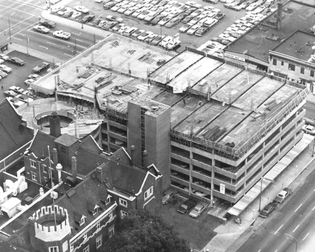
There were parking ramps in the 1920s, the early days of the automotive era, but they were small compared with today's big, boxy ramps. In the post-World War II, pro-car era, many smaller, two-story mixed-use buildings, which formed the urban fabric of the cities, were replaced with graceless car-containers. Most of them are boring, built to do one thing, and seem indifferent to the idea of beauty.
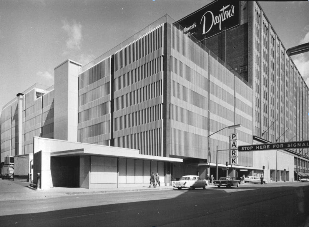
But not all of them. Consider the most impressive ramp of the post-war era. The Dayton's ramp on 8th Street between Nicollet and Hennepin avenues, finished in 1959.
To modern eyes it has the standard sins of a parking ramp: The street level view is a dark maw. The facade is windowless and blank. It's a storage bin, a place where nothing happens.
But at the time it was startlingly modern, a sign of a healthy downtown that was building again. The facade consisted of interlocking lines that formed a pleasing, abstract pattern. Compared to all the old brick buildings downtown, it was an emblem of the future, clean and logical.
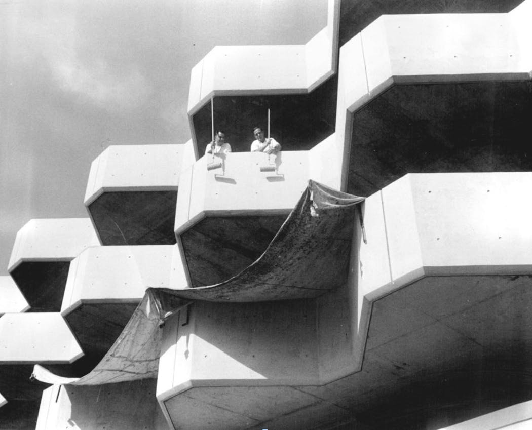
Or consider the parking ramp built during the 1960s urban-renewal project in downtown's Gateway district, next to the Sheraton-Ritz Hotel, demolished in 1990. The ramp was almost a piece of abstract sculpture, its wavy lines giving some motion and energy to the block. And it was pink!
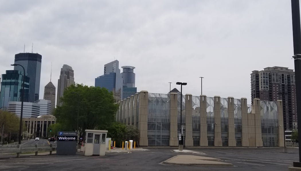
Sadly, most of the ramps in American cities are dull, at best, and enemies of an interesting street at worst. The Energy Center ramp (324 S. 9th St.) is a raw concrete insult. The massive ramp in the Northstar Center (110 S. 7th St.) rises blank and indifferent for seven stories.
The LaSalle Court ramp (8th Street and, well, LaSalle), has a windowless facade that looks like a 1960s office tower gutted and abandoned. The Minneapolis Club ramp (8th Street and 3rd Avenue S.) is as homely as its namesake is handsome.
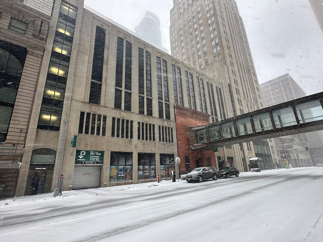
Perhaps the most striking — and conflicted — recent ramp is on Marquette Avenue between S. 5th and 6th streets. It has a "traditional" facade that pays vague historical homage to its neighbors, but it also has a wonderfully bizarre slab of Egyptian Revival architecture, a remnant of the bank that once stood on the site. And it's lanced by a skyway for good measure. The effect, as we say up here when we don't want to be mean, is different.
Is there anything good to say about the parking ramp?
Yes.
1. At least they're not parking lots.
2. They can be beautiful, or at least interesting. The decoration of the Convention Center ramps gives the structure a delicacy, a connection to old Arts and Crafts design.
The massive A, B, and C ramps on the north edge of downtown are not just ideal for commuters or Target Field attendees, they're clad with brick and stone, materials that carry forward the style of the Warehouse District.
The US Bank Stadium ramp (740 S. 4th St.) almost looks like a modern office building — good or bad, depending on your view, but it has irregular reflective windows, and large decorative panels with monochrome woodland scenes. It's pleasant to see.
This might be as good as we get, and we should hope we get more. That will rankle some who do not want more ramps, because they do not want to facilitate the hated car. In their not-so-humble opinion, everyone should take the bus or the train or bike. OK, but everyone won't, unless the city makes it painful to drive to work. Is this really the time to get particular about how people get downtown?
One of the things that will get more people back to the office — and thus help downtown, and thus keep property values up, and thus benefit the city in the form of tax revenue — is an easier and cheaper commuter option. Why not include ramps that are actually attractive in the mix?
Ramps with color inside, a cafe in the lobby, a fountain, a green space. Ramps with housing towers on top. You want more people downtown? Make parking denser, easier, nicer and cheaper.
Or watch people drive to the burbs, where parking is plentiful, ugly and free.
For 'Legally Blonde' star, 'being underestimated is her secret superpower'

Restaurant openings and closings in the Twin Cities

Minnesota's Amy Thielen launches old-fashioned radio show for food lovers
Yuen: How success has pushed Minnesotans off sidelines in trans athlete debate

