The simple designs favored by Minnesota's new state flag commission drew a mixed response online, as some amateur critics took to social media to express outrage that the designs with a loon glaring at the viewer or shooting laser beams didn't make the cut.
The chosen six "just kind of seemed like generic company logos to me," said Ryan O'Brien, a 36-year-old sales director from St. Paul. He pronounced himself underwhelmed. "I'm not angry about them, I just didn't get it."
So what about the actual experts? In interviews, flag experts and graphic designers generally praised the six choices. Vexillologists — yes, there's a word for people who study flags — said Minnesota's finalists mostly follow the guidelines of flag design.
Ted Kaye, secretary of the North American Vexillological Association, said he thinks the six finalists are a "good start." But he also suggested one or more changes to each. A common critique was that the flags are "trying to do too much" and should be simplified in order to be distinguishable from a distance.
"All of these designs have a great flag in them trying to get out," Kaye said. "They all need work, but that's OK."
Kaye compiled the criteria for a good flag in his 2006 book, "'Good' Flag, 'Bad' Flag," using the teachings of numerous flag designers and scholars.
The book's five principles for a quality flag were:
- Keep it simple.
- Use meaningful symbolism through images, colors, patterns or divisions.
- Use only two or three basic, contrasting colors.
- Include no lettering or seals.
- Be distinctive but show inspiration from other states' flags.
These principals have been used in almost every flag design in the years since the book's release, Kaye said. He also shared those principles with the commission responsible for picking Minnesota's new flag.
With that in mind, here's what Kaye and others thought of each of the six flag designs:
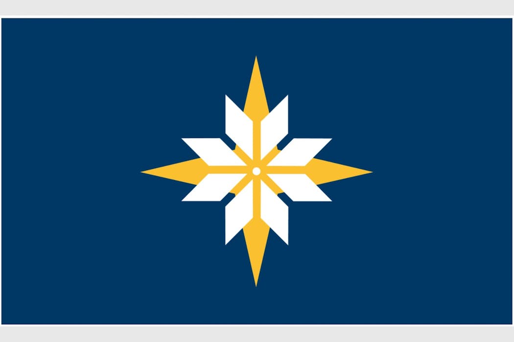
This flag suffers from having two light colors — white and yellow — overlapped in the center, Kaye said. The two symbols will appear to merge together when viewed at a distance. Kaye recommended removing one of the symbols to make the design more readable.
Bill Lindeke, who has written books about Twin Cities history and sells St. Paul's and other local city flags online, said this was his favorite of the six submissions.
"It's iconic, simple and interesting colors with a unique design to it that would stand out from other states," he said.
Kaye said he "loves" the Minnesota shape on the left side of the second design. He also appreciated how it makes an "M" if you look at it vertically. But several aspects made him think it's "trying too hard."
"The sequence of white, over green, over light blue just seems weird to me," he said.
Kaye said four colors are unnecessary, and suggested one or two colors to the right of the dark blue section. He also took issue with the star's four smaller spikes.
"I would either go with four points or eight stronger points," Kaye said.
Kaye called the third finalist a "stunning design" and one of the better options among the six. He liked the unique star or snowflake in the center and how it creates an "M" shape on all four sides.
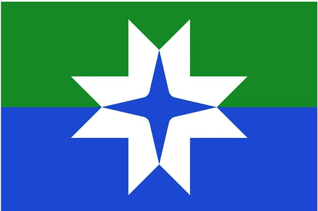
He found the blue four-point star in the middle pleasing, but said it could be improved by making the bottom half of the inner star green. It would be similar to the alternating red and white crosses in Maryland's flag, a technique known as "counterchanging."
Kaye's main criticism was having two dark colors on top of each other. He recommended making the green lighter and the blue darker.
The fourth design is the only one that includes a slight homage to a loon, with two swoops that could be seen as two birds, or perhaps a body of water with snow above it.
While he thinks it works "wonderfully" as an organization logo or postcard, Kaye said it's too complicated to work as a state flag and doesn't need four colors.
"I love the whimsy of this, but I don't see it as a successful flag design," he said.
Part of his critique was that straight lines will already become curvy when a physical flag flaps in the wind, making the design too complicated from afar.
"It has to pop when it's at a distance, flapping and seen from both sides," he said.
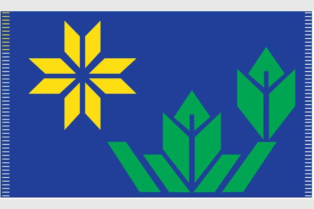
The fifth flag shows another eight-point star divided into rhombuses, along with some plants.
Again, Kaye said he thinks the flag is "trying to do too much."
"If I were to improve this flag, I would just take all that green off and keep that beautiful, interesting eight-pointed star," he said.
Kaye said he is not a fan of the short white and yellow lines on the edges.
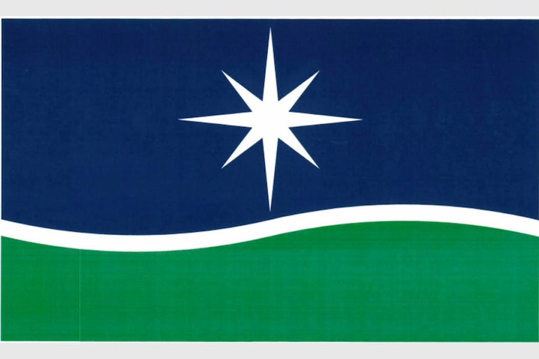
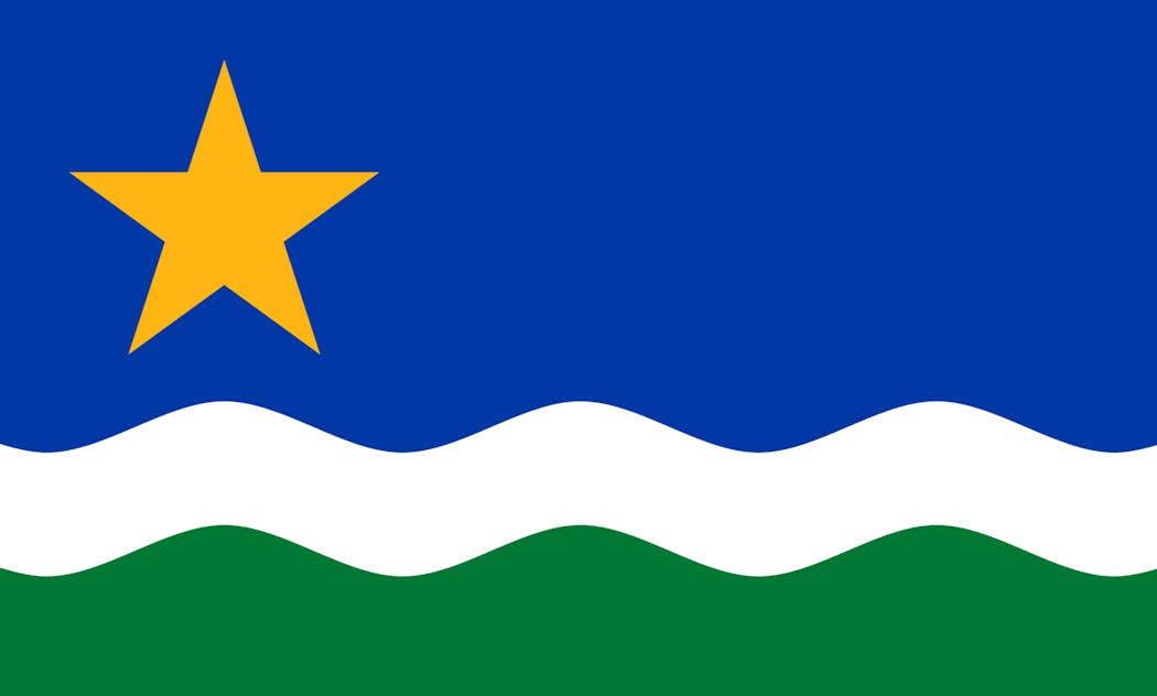
Kaye pointed out that this design is similar to the "North Star Flag" design from 1989, when there was an unofficial contest to remake the Minnesota state flag and move away from the current one with a seal on it.
Kaye suggested making the white wave in the middle twice as wide to be visible from a distance, and moving the star to the left side of the flag. He also recommended making the star less spiky.
Asked which flag finalist was his favorite, Kaye said he hopes the 1989 North Star Flag is considered. It did not make the final six.
Lindeke, meanwhile, said he finds this submission boring.
O'Brien suggested adding "Minnesota" to the final design. While including text would break one of the main principles Kaye laid out, there are popular flags that don't abide by that rule. California's, for instance, is beloved despite including the words "California Republic" below a bear.
In response to complaints, Kaye stressed that the significance of a flag can develop over time. He pointed to Canada's now-beloved maple leaf design, which has become more widely known as a Canadian symbol since the flag's inception.
Want to share info with the Star Tribune? How to do it securely

'Safe recovery sites' would offer syringes, naloxone and more to people using drugs. The plan could be in peril.
New Minnesota GOP leaders seek peace with party's anti-establishment wing

Who is Republican Lisa Demuth, Minnesota's first House speaker of color?

