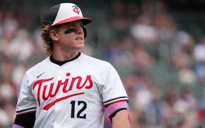
The Twins on Monday became the last major league team (of the 28 taking part) to unveil their new Nike-branded City Connect uniforms. But it seems more accurate to consider them the first team to take the project in a different direction.
"We did this as a State Connect" uniform, said Heather Hinkel, the Twins vice president of brand marketing, who helped coordinate the three-year-long design process with Nike. "We didn't pick a city, we leaned into the whole state of Minnesota."
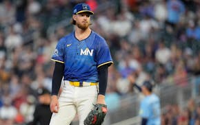
The result is a predominantly blue uniform, with bright yellow highlights, meant to represent the "Land of 10,000 Lakes" nickname of the Twins' home state.
The sobriquet is even sewed into the back of the new blue caps, and nowhere on the uniform do the words "Twins," "Twin Cities" or "Minnesota" appear. The front of the jersey simply uses the postal code MN to identify the team, with the North Star between the white letters, and the cap features the outline of the state, with waves, northern lights and the North Star within.
Like each of the City Connects rolled out since the program began in 2021, the jerseys include numerous details, some subtle and some obvious, meant to reflect the unique qualities of each team's market. In the Twins' case, the most conspicuous touch is the pattern of undulating stripes, in a variety of blue shades, across the jerseys, meant to evoke the ripples and waves of a lake's surface.
The yellow on the bill of the cap, belts, socks and a stripe down the side of the blue pants — oh, and the Nike logo — suggests the reflection of the sun on a lake's water, Hinkel said.
An image of a loon, the state bird, adorns a sleeve patch, and on the underside of the cap's bill, the outline of Lake Minnetonka — a nod to Prince, Hinkel said, who in the movie "Purple Rain" tells Apollonia, "You have to purify yourself in the waters of Lake Minnetonka."
"It's cool they integrated the lakes, and the vision is to bring the whole state together. That's a really great idea," said righthander Joe Ryan, who offered some ideas of his own during the design process. "They did a good job capturing Minnesota, and I'm excited to put them on."
Ryan will get his first chance on Friday, against the Athletics. The Twins will wear the new "Ripple Effect" uniforms, as they have dubbed them, during every Friday home game for the remainder of the season, and also in the next three Saturday home games, a total of 11 appearances in all. The team hopes fans will equate the lake-themed games with the Minnesota tradition of "heading to the cabin for the weekend," Hinkel said.
The Twins also hope fans will invest in the new look themselves. The jerseys and caps are already on sale at the Twins' team stores, which, let's not kid ourselves, is the point of the promotion.
"It's about trying to excite a new fan base," Hinkel said. "Not only our current fan base — we're really trying to tap into that younger, more diverse fan base."
It's a fan base that has already been asked to invest in a new look; the Twins redesigned their standard set of uniforms 18 months ago, which is why they asked to delay their City Connect debut until this season.
Included in that rebranding was their now-familiar cream-colored "Twin Cities" jerseys, which "we call our 'behind-the-scenes City Connect,' " Hinkel said. The City Connect program is intended to change those jerseys every three to four years, but the Twins want the option of keeping the Twin Cities jerseys — a reference to the fact that owner Calvin Griffith intended to call the team the Twin Cities Twins when he moved the Washington Senators here in 1961, an idea that MLB vetoed — on their players for longer than that.
Most Twins players intend to add their own touches to the new uniforms, primarily with special shoes, though catcher Ryan Jeffers has a catcher's mask, chest protector and leg guards that incorporate the 10000-Lakes theme.
"I'm more of a sock person, so I want the socks to be cool," said Byron Buxton, who modeled the new uniform during a secret photo shoot during spring training. "I just like being different. Let's bring in a little bit of yellow. It's got a little bit of pinkish in it [on the pants stripe]. That's cool. Just to bring out different colors, for me, that's something fun."
The City Connect uniforms have had mixed success. The Nationals' jerseys featuring Washington's cherry blossoms, the Padres' white-pink-and-green depiction of beach colors, and Seattle's subtle salute to the Pilots have been among the best-received, according to Phil Hecken, editor of Uniwatch blog, which has covered sports uniforms for more than 25 years. The Cubs' Wrigleyville jerseys, and the White Sox's South Side, are popular in Chicago. (The Yankees and A's are not participating.)
"But uniforms need to serve two functions — identify the team, and identify the player — and a lot of them don't. Some of them are too cute by half, and if the identity is indiscernible, what's the point?" said Hecken, who had not seen the Twins' versions. "They are literally fashion jerseys, meant mostly to drive sales, but being worn on the field. Some of them are great. I personally love Boston's [Marathon-themed yellow-and-blue] uniforms. But Toronto's, they look black from the stands. It looks like there are 13 umpires on the field."
Most City Connect jerseys include intricate patterns like the Twins' wavy blue. The Tigers' have tire tracks, the Mets' pinstripes that resemble subway maps. They are a product of sublimation, a printing process that uses heat and pressure to transfer dye onto the fabric, an attempt, Hecken said, to thwart widespread counterfeiting of the jerseys by creating a difficult-to-copy template.
Whether fans will embrace such a different look is a difficult-to-predict proposition. But the Twins themselves seem impressed.
"They are sick. I like the different colors," Royce Lewis said. "I wish we could have, like, 20 different uniforms."

Twins lose second in a row to Blue Jays as bullpen falters late
What is the 'House settlement,' and what does it mean for the Gophers and NCAA?

Souhan: Anxiety and depression in the NFL helped inspire Lindsey Young's children's book
Neal: Trade season is here ... and now it's time for the Twins to act


