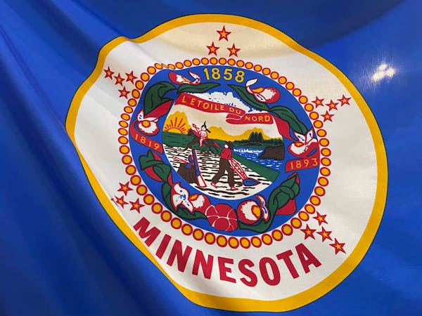
High above the Minnesota Capitol, the state flag was flying upside-down again.
An inverted flag is a signal of dire distress.
Distressingly, almost nobody noticed.
Lee Herold, owner of Herold Flags and Flagpoles in Rochester, noticed. Flags are his business and for years he's made it his business to visit the Legislature to petition for a better flag for Minnesota.
A flag with less nudity and less racism. A flag free of poorly drawn horses. A flag you don't have to label with MINNESOTA in big red letters just to tell it apart from 19 other state flags that look just like it.
Minnesota has been trying to build a better flag for decades. This could be the year it happens.
As the Legislature hurtles toward the end of session, tucked into a massive House omnibus bill is language that would sunset the current state flag and seal and set to work on a redesign.
If we're lucky, Minnesota will rise to the ranks of states with good-looking flags. Flags residents are proud to plaster on mugs and sweatshirts or tattoo on their biceps with no fear that a small child is going to point and ask why the man on the horse on the flag isn't wearing pants.
If we lived in a state with a decent flag, we'd know it. Because that flag would be everywhere.
"When you have a really good flag, people want it. They use it with enthusiasm," Herold said. He still remembers scanning the jubilant crowds that took to the streets in 1987 when the Twins won the World Series. Absolutely nobody was waving the Minnesota flag around to celebrate.
People do come to Herold's Flags to buy state flags from time to time. But it's a flag more likely to inspire blank stares than enthusiasm.
"They say, 'Oh. Is that what it looks like?'" he said with a chuckle. "You go to other states with better flags and nobody doesn't know what it looks like."
Sometimes a different flag catches a customer's eye. A bold star above rippling fields of blue (for Minnesota's lakes and rivers), white (for our winters), and green (for the forests and fields). This is the North Star flag, a prototype Herold designed in 1989 with a fellow flag enthusiast, the Rev. William Becker of Winona.
In keeping with the rules of good flag design, the North Star flag is bold, attractive and so simple a child could draw it from memory. There's no other state flag quite like it.
There are more important issues the Legislature could be tackling right now, and is tackling right now.
But for Rep. Peter Fischer, DFL-Maplewood, who has championed a redesign for years, this flag is Minnesota's business. If the state symbol isn't representing the state at its best, it's the Legislature's job to do better.
"This is our brand," said Fischer, who teamed up with state Rep. Mike Freiberg, DFL-Golden Valley, who was working on plans for a task force to redesign our terrible state seal. "Flags should have meaningful symbolism, a few colors and it should be something that people can recognize from a long distance."
Right now, Minnesota's brand is unrecognizable at a distance and recognizable up-close only as an insult to Dakota, Ojibwe and state history — and as an assault on the eyeballs of the entire North American Vexillological Association.
These flag enthusiasts ranked Minnesota as one of the 10 worst flags in North America, bringing up the rear of a parade of cookie cutter seal-on-a-bedsheet blue banners.
A century and a half ago, Minnesota's territorial Legislature balked at a territorial seal design featuring an Indian family offering a peace pipe to a white settler. According to Minnesota Historical Society accounts, "many of the lawmakers believed there would never be peace in Minnesota until all the Indians had moved westward out of the territory."
So the state seal was designed with an Indian exiting westward toward the setting sun, under the watchful eye of a white plowman with a gun in grabbing distance. Generations of bloodshed, heartbreak and broken promises embedded at the center of our state brand.
Mississippi redesigned its state flag; replacing Confederate iconography with a magnolia blossom that anyone would be proud to wave.
Anything Mississippi can do, Minnesota can do eventually.
"I don't think that changing a major state symbol should be a simple thing," Herold said.
Moving too fast was how Minnesota's original territorial seal ended up both racist and riddled with typos.
"I'm not real upset that it's taking time and people are thinking it through. That's a good thing," he added. "But it does need to be done."

Brooks: Hard lives led to hard-won diplomas for these Minnesota high schoolers

Brooks: America mints its last penny. What's the new going rate for our thoughts?

Brooks: From big beavers to little bears, meet Minnesota's newest state symbols

Brooks: Kristi Noem's 'Hunger Games'? It could actually happen.


