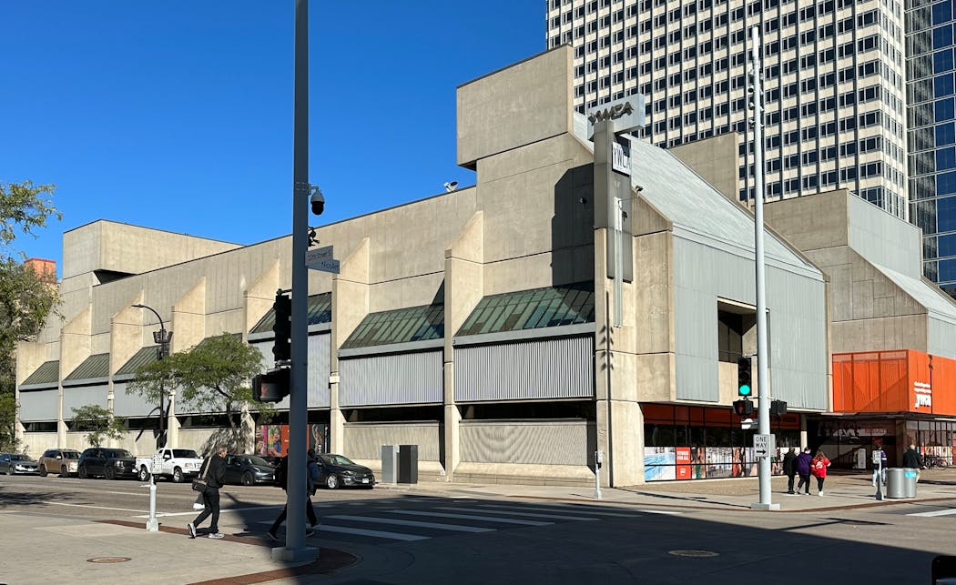
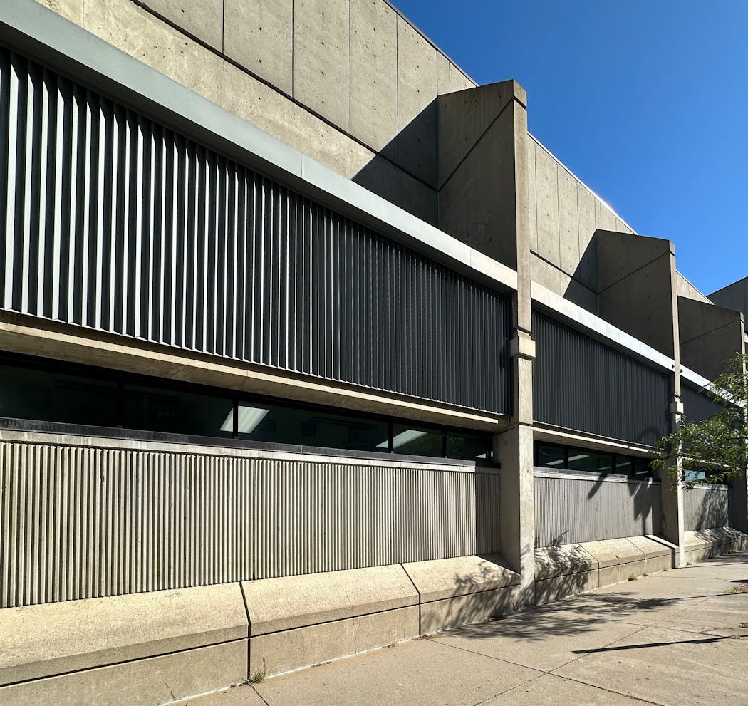
The downtown Minneapolis YWCA on Nicollet Mall at 12th Street is slated to close in November. The building will likely be sold, and, if the fates smile upon us, it will be demolished.
While the closure of the popular fitness center is sad, the demise of the building that housed it might make some people pop corks and cheer — that one of the ugliest buildings downtown is now scoured from sight.
There's no excuse for a building like this, there are only explanations. It was built at a time when Brutalism, a style that celebrated raw unadorned concrete, was in vogue.
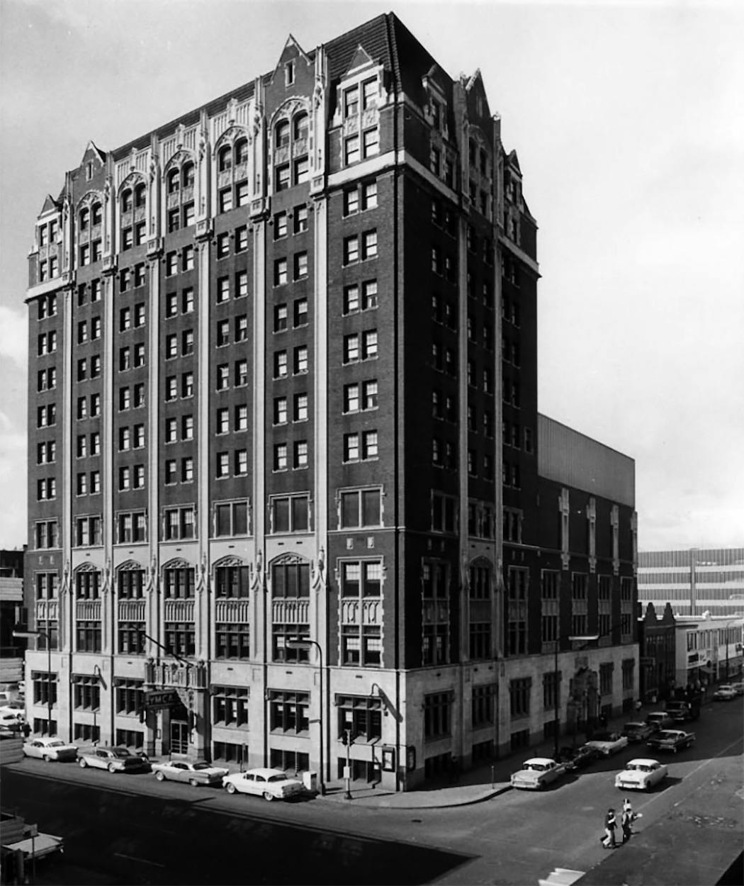
Compare it with another former downtown Y. The YMCA (now LaSalle Apartments) at LaSalle and 9th Street looks like other big, Y-branded buildings of the post-World War I era: a few ornate stone details on a basic brick box. The Y, after all, was a place where a fellow could get two hots and a cot at a philanthropic price, so the buildings didn't code Ritzy. But they carried forward the architectural traditions of the time.
Built in 1976, the YWCA on Nicollet wasn't interested in tradition. It wanted to make a brave and bold statement about the new possibilities of architecture to use cheap materials in interesting ways, to bring new forms to the streetscape.
Well, it did that.
And, like many of the Brutalist buildings that litter the land, it ended up an unlovable carbuncle, a gray tomb that could be a clinic, a day care or a crematorium. The sort of building that subsequent generations had to gussy up with colorful banners or bright-hued art.
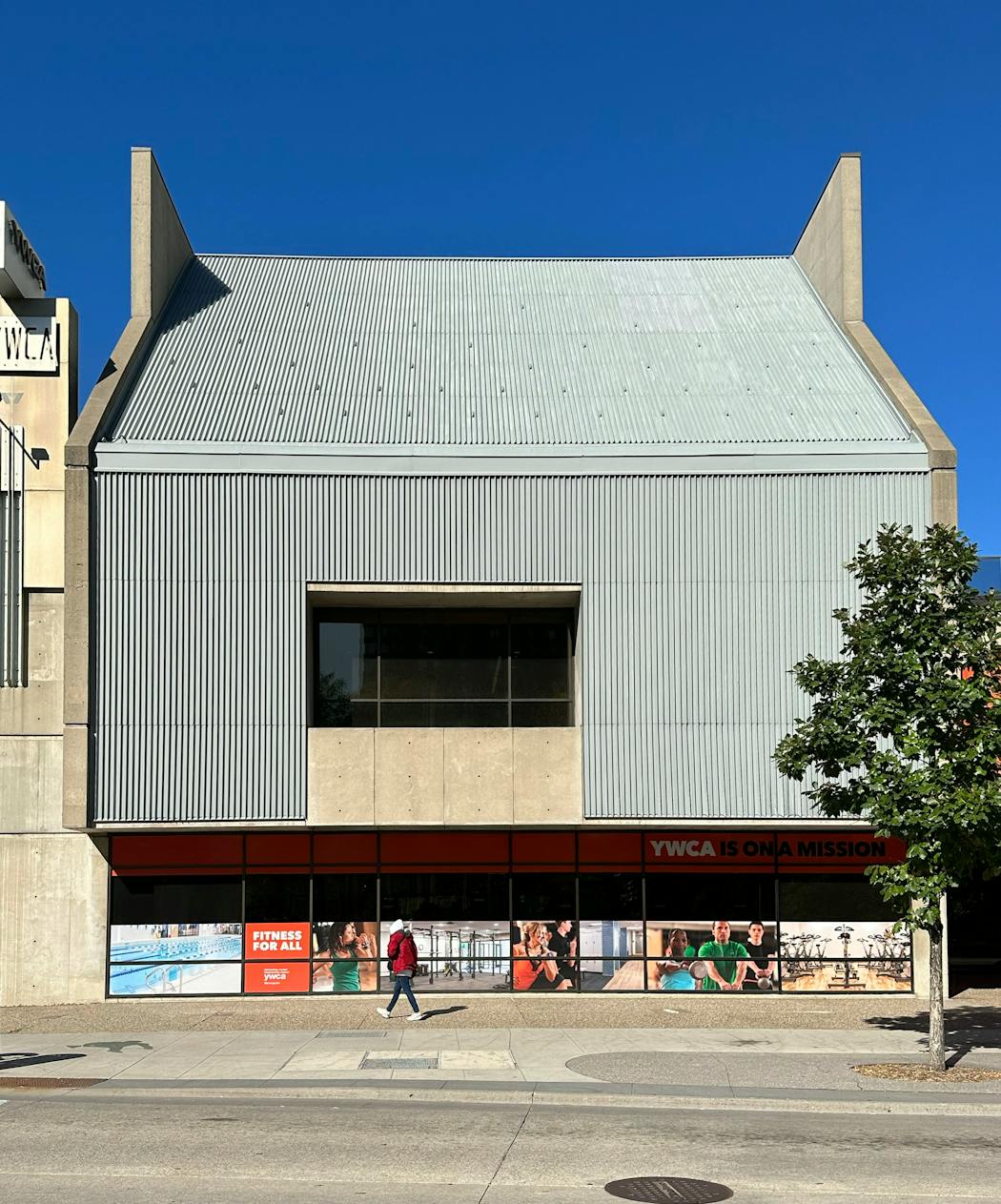
It has all the regrettable cliches of the time: A boring first floor that turns its back to the street? Check! Holes in the wall to indicate where the concrete was pumped? Check! A dark maw for an entrance? Check! Abstract shapes that give no indication as to their function? Check and double-check (since there are two boxes on the second floor).
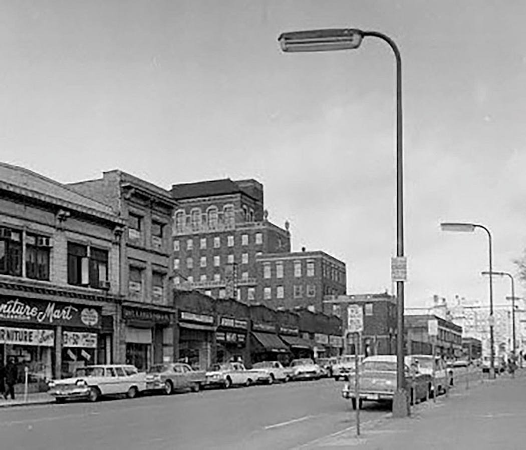
Its predecessor on the site, also a Y, was a dull blocky building, a 1929 dullard that rose eight stories.
It had minimal ornamentation and lopsided massing. But a bad '20s building is usually preferable to a bad '70s building, because the former doesn't look like it hates the culture that produced it.
So, even though it would be fine if the current YWCA's downtown structure were pulverized and replaced, there's one good argument for keeping it around.
Some people like Brutalism, a style not named for its brutish, unlovely forms, but for the French word for "raw." As in raw concrete. In the '50s, '60s and '70s, this style of architecture was thought to be interesting. And if you constantly remake buildings to reflect the contemporary design prejudices, you lose the record of how each architectural era made its mark.
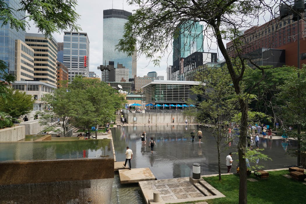
True. But the YWCA doesn't exist in a vacuum, a one-off alone in a neighborhood of elegant old structures. It faces the broad expanse of Peavey Plaza, which itself is a collection of abstracted concrete shapes, albeit arranged with more care, and certainly more likable.
Combined with the modernist Orchestra Hall, a more amenable example of '70s design ideas, the area is a testament to a particular set of ideas about urban spaces, favoring abstracted elements and the use of minimalist materials.
Peavey and Orchestra Hall represent those ideas at their best. The YWCA is at the opposite end of the spectrum. You understand the era better if you see the good and the bad.
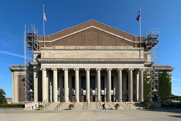
Still, this isn't a sufficient reason to keep the YWCA. Rebuilding with something tall and refined would be better. Something that completes the corner with a bit of panache and ties together the great open plaza, the nearby residential tower, the stately grandeur of the Westminster Presbyterian Church.
But before we dance a jig on the YWCA's grave, let's give it credit for something it tried to do. The 12th Street side of the building has a series of flat slabs, regularly spaced, rising two stories, tapering into triangles.
When I went to look at the building on a recent Sunday morning, I heard church bells ringing and I realized that those slabs might have been a nod to church buttresses. An architectural acknowledgment of the C in YWCA.
It did make me pause. I honestly hate the building and will be glad to see it go, but I wonder if there's something more to it. What else might I have missed in that concrete bunker? What else should we note before it goes?

Can a prison be beautiful? And should it?

Never mind the oldies — here are 10 younger acts to see this summer in Minnesota

Review: Conrad Tao delivers a thrilling Beethoven piano concerto with the Minnesota Orchestra

Missing Joann? Textile Center's new Stashery sells discounted fabric and yarn.

