It's odd but true: Northrop Mall on the University of Minnesota's main campus is one of the metro area's great urban spaces. And yet, we don't think of it as a public amenity.
But anyone can walk among the columned buildings through the great green expanse of the mall. It's a welcoming space that feels settled and serene, a high-minded monument to Western Civ 101.
When you learn what it could've been, however, you might feel a bit cheated.
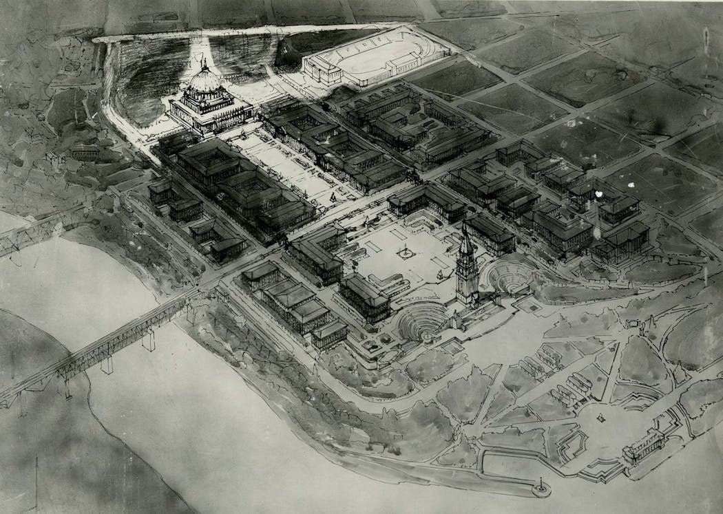
In 1907, the university called for plans to expand the campus. Cass Gilbert (already celebrated for the Minnesota State Capitol) submitted several designs. The U leaders chose an ambitious plan to build more than 30 structures. It would be capped on the north end by "Academic Hall," where Northrop (formerly Northrop Memorial Auditorium) is now. A grassy mall would extend to the south, flanked on each side by classically inspired buildings.
It would have cost a fortune. A recent evaluation by the Society of Architectural Historians criticized the design for being "long on romance and short on details."
The plan languished for a while. Eventually, Clarence Johnston, a St. Paul architect who had lost the State Capital job to Gilbert, was hired to tweak the plan and bring it in for less money. Construction began in the teens. By 1929 Northrop was finished, capping the mall.
Northop Mall echoes the Romans and the Greeks, filtered through Thomas Jefferson's design for Monticello. The United States had a classical revival in the early years of the republic (see also, the U.S. Capitol), but that had been supplanted by other styles as the 19th century elapsed.
After the 1890s, though, the classical styles were back, thanks to the visions of a radiant city seen by millions at the World's Columbia Exposition in Chicago 1893. The "City Beautiful" movement inspired cities across the country to draw up plans for urban renewal that echoed the broad boulevards of Paris, and blocks of uniform, compact, low-slung structures. It was modern and popular.
If the mall hadn't been proposed or built when it was, it might have been a collection of Louis Sullivan-style structures writhing with abstract foliage, or sleek white Moderne streamlined buildings that looked like the Emerald City of Oz.
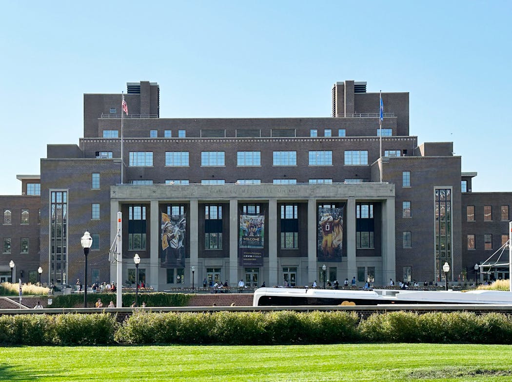
To get an idea of what it might have been, look at Coffman Memorial Union: Finished in 1940, it's a stripped-down version of a classic mall building, with thin fluted columns that serve only a decorative function — a symbolic wave to the thick columns of its older brother Northrop on the other end.
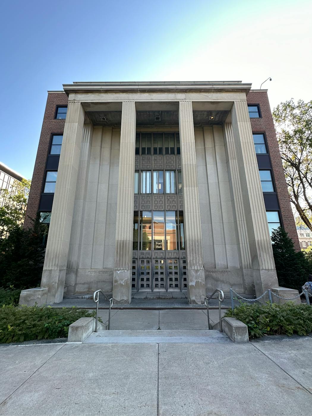
Two buildings on the mall were added much later, designed by conscientious architects who had respect for the site. Ford Hall, an early 1950s design, has the same dimensions as its kin, and it has a portico with columns. But as with the Coffman building, the columns are decorative. To be fair, they're usually decorative in modern "classical" buildings, not structural — but Ford is a bit more forthright about the matter.
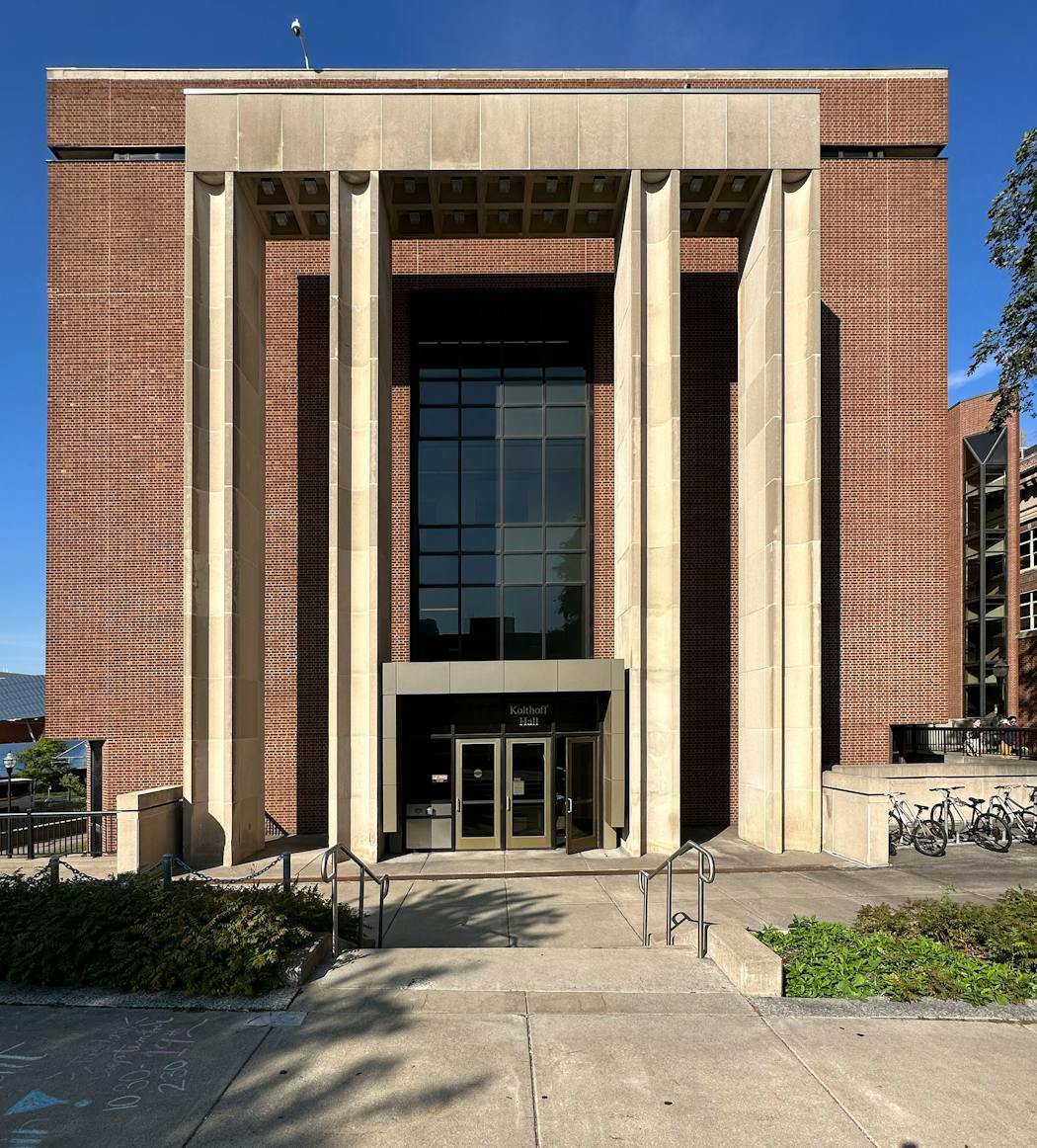
Kolthoff Hall (1972) has a portico with four square columns. They are disconnected from the building itself, and provide an almost grudging connection to the rest of the buildings along the mall. But it works.
We're lucky it turned out so well. We're accustomed to the way Northrop and Coffman bookend the Mall, and it looks right.
But that's not what it was supposed to be.
In Gilbert's original plan, there was no Coffman Union. Instead, two L-shaped buildings on Washington Avenue were supposed to bracket a grand European-style plaza. Walkways and switchbacks with ornamental plantings would descend to the Mississippi River, where there would be an open-air theater embedded in the hill on one side, and a botanical garden on the other. At the water's edge, Gilbert's plans called for a small harbor, no doubt with classical details and ornamental light fixtures.
It would've been one of Minneapolis' most glorious civic spots. It also would have sparked a move to regard the river as something more than a mode of transportation and a home for industry.
If it had been built, it might have eventually been defaced by modernists who held the old classical ideas in contempt, and "refreshed" it in the 1960s or '70s with that dreary Campus Brutalism that mauled so many colleges with concrete walls and abstract sculptures.
In the 1990s, it might have been remade with a Frank-Gehry-style heap of jagged aluminum, because some modern architects — and their patrons — love to mix ahistorical, anti-human buildings into classical compositions.
So perhaps we should be content with what we got: the literal definition of a college campus, a brochure-perfect space, a solemn theatrical set for the ancient story of learning new true things. And for growing up.

2 block parties and an egg roll fest bring the fun — plus 7 other free things to do this week

Yuen: When cancer struck a second time, she found 'euphoria'

Medcalf: This summer, let's all be more vigilant about our children — and everyone else's

What is Alsatian pizza and where can you find it in the Twin Cities?

