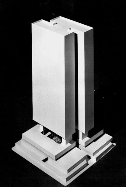
When the IDS Center opened in 1972, the office/hotel/retail complex, designed by architects Philip Johnson and John Burgee, was showered with critical acclaim.
While much attention was focused on the center's skyline-defining 57-story tower, admiration also rained down on the Crystal Court, the soaring interior piazza capped with plexiglass skylights. It's a rarity: a private space that feels entirely public.
The Crystal Court has received its share of updates. The last renovation was 24 years ago, when Minneapolis-based HGA added an eye-catching fountain, olive trees and white benches.
More recently, Accesso Partners, the center's Florida-based owners, tapped the Minneapolis office of Perkins & Will to refurbish the landmark space. The $5 million makeover, five years in the making and a model of sensitivity and ingenuity, was completed in 2021.
Perkins & Will architects Tony Layne and Jeremiah Collatz discussed the importance of soothing sounds, the virtues of hidden assets and the necessity of respecting the past.
Q: What was it like to work in such a landmark environment?
Tony Layne: For me, this was very personal. When I moved here 22 years ago, I walked through the Crystal Court every day when I went to work. It becomes part of your identity.
Jeremiah Collatz: Everything we did was designed as an enhancement of something that was already there, but we did it in a way that felt current and updated, or that helped you to appreciate the iconic elements of the space in a way that maybe you couldn't previously.
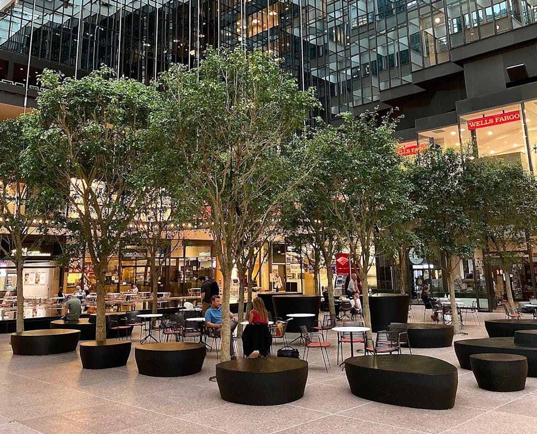
Q: A big change involved moving the trees from big boxy planters and having their roots grow below the floor. Describe that.
Collatz: It was actually quite a substantial technical feat. There are multiple parking decks below the Crystal Court, so there was substantial structural work done in order to support the root systems of the trees. But when you come to the Crystal Court today, you don't think about any of that hard work that went on below the grade, because you don't see it.
Q: What alterations did you have to make to the concourse space below the court's pink granite floor?
Collatz: Because that space was originally a movie theater, it had very ample ceiling heights. What's really exciting is that we were able to put in all of this infrastructure and there is still usable space for future uses. We didn't have to decommission space in order to have healthy trees in the Crystal Court.
Q: What are the specifics of those trees?
Collatz: They're a type of ficus tree, the scientific name is Ficus benjamina Wintergreen. At their expected growth they'll be a full 24 feet tall, they're substantially larger than the olive trees that had previously been in the Crystal Court. That was really the intent, that we could create a real canopy so that when you are sitting amongst them you can almost feel like you're in a room within a room, or in a natural grove.
Q: What was the strategy behind the new fountain?
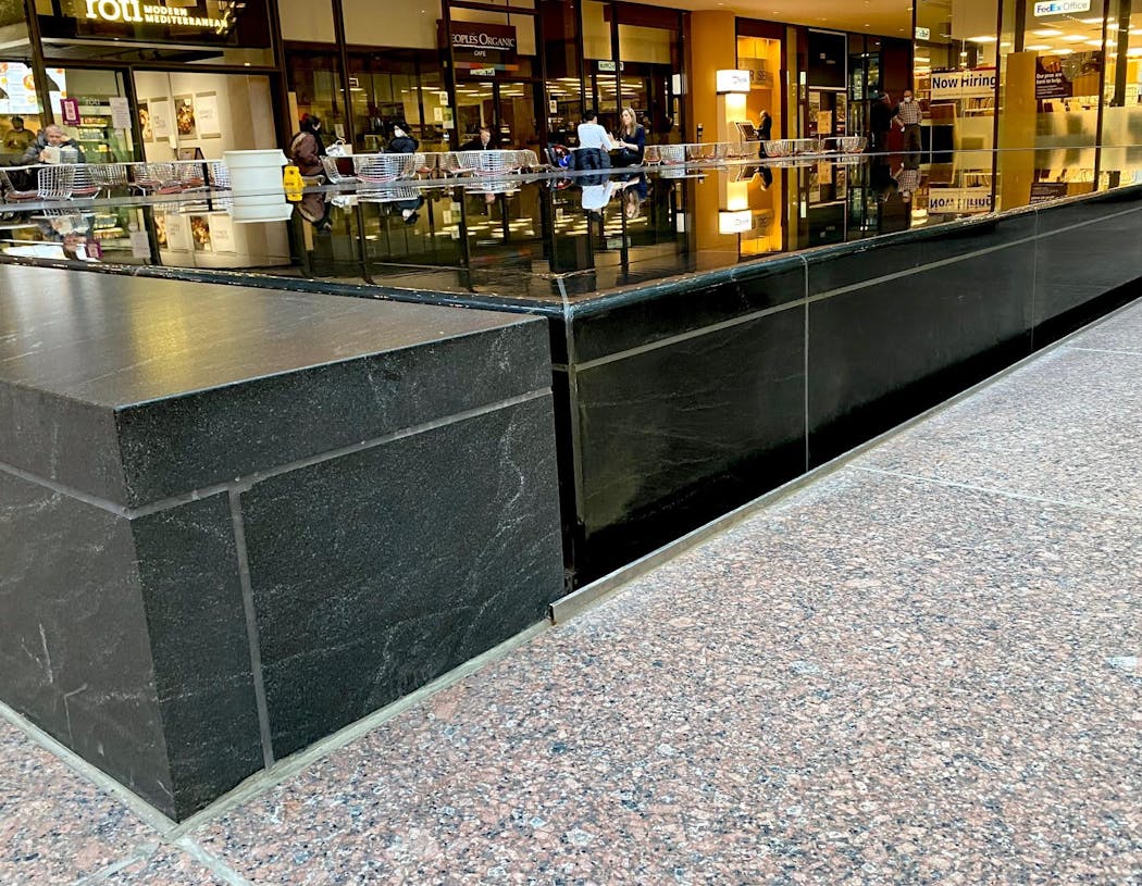
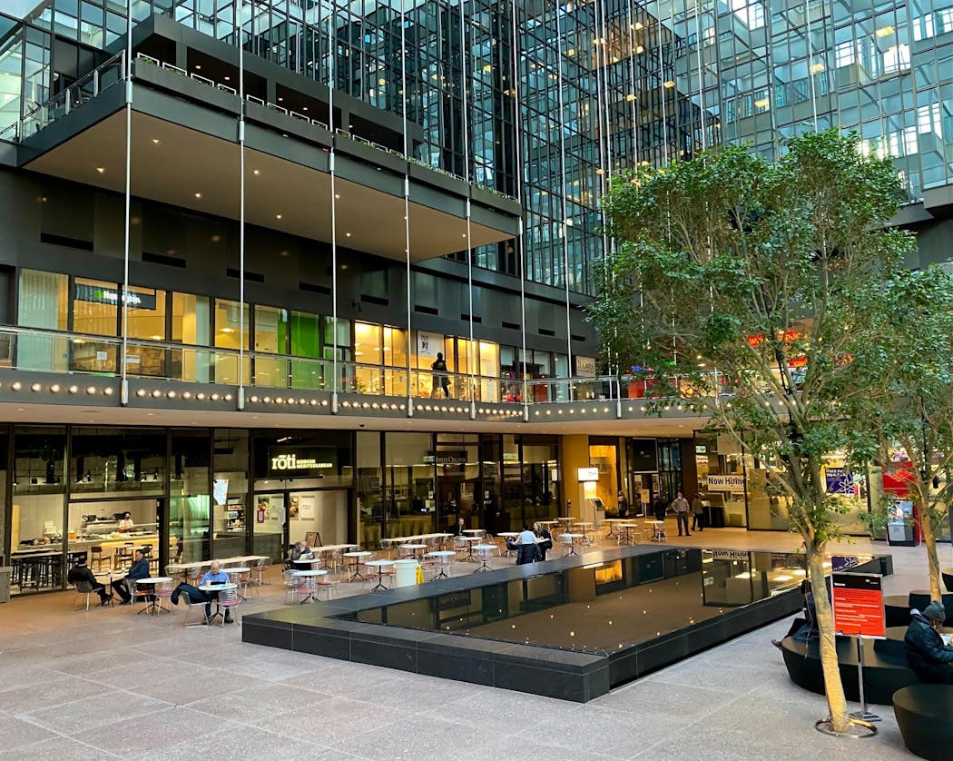
Layne: One of the things that we always talked about is how great that ceiling is, and how do we really respect and highlight that ceiling? The first way was by lighting it, and the second way was wondering if there was a way to reflect the ceiling in the ground plane. That was the inspiration for the reflecting pool. We did a lot of testing: the kind of stone, the depth of the water, all those things.
Collatz: Another aspect of the water that's very important is the acoustic quality. Instead of having a canned music-filled hall, the music of the Crystal Court was always intended to be the sound of water.
Q: Why did you use black granite? The prior fountain was made with the same pink granite as the floor.
Layne: It's granite, it was important that it was in the family of what's there today. But the reflectivity was key. Also, being visible was important. If it was going to be pink granite, that felt like it would blending back into what was already there. The whole platform can be drained, and it's designed to be used as a stage.
Q: Did you ever feel the spirit of Philip Johnson hovering over you?
Layne: One of the things we asked ourselves was, "If Philip Johnson had the budget and the technology, what would he do today?" Pushing the trees down into the floor, that was something we felt was very much in line with what he would have done.
Q: The seating is a significant departure from the white benches. Why?
Collatz: We have table and chairs, and then we have these custom bench elements that provide seating in multiple configurations at multiple heights. We also surrounded the reflecting pool on three sides with very generous granite benches, such that you can sit down adjacent to flowing water. It's a way to kind of decompress.
Q: What's unique about those benches?
Collatz: They're 3D-printed in a biopolymer. To our knowledge, they're the first-ever furniture or interior architecture application of that 3D-printed technology. The shape was inspired by stones on the shore of Lake Superior.
Layne: They're a little bit of a counterpoint to the geometry of the court. And they're also a counterpoint to the other furniture that's there, which is much more of a Midcentury Modern selection.
Q: Did you change the lighting?
Layne: We put a lot of effort into how to highlight that beautiful sculptural ceiling. Now, there's new LED lighting all up in that structure that you don't even know is there until it's on. We went through a lot of gymnastics to make it look like we didn't do anything at all, much like the structure that's holding up those trees.
Q: Final thoughts?
Layne: I have to give the [building] ownership credit. They said, "Look, if we're going to do this, we have to do it right, we can't screw it up." We do a lot of this kind of work and often it's like, "Clear it out, we don't care, get rid of that old stuff." But the Accesso team was a great client.
This conversation was edited and condensed for clarity.
Kick off summer with these big-time, can't-miss festivals

2 block parties and an egg roll fest bring the fun — plus 7 other free things to do this week

Yuen: When cancer struck a second time, she found 'euphoria'

Medcalf: This summer, let's all be more vigilant about our children — and everyone else's


