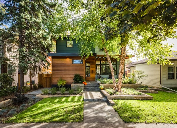
The challenge: Janelle and Scott Nivens wanted a lighter, brighter and more open kitchen to comfortably host large groups in their southwest Minneapolis home. They also preferred a more casual eating nook to their formal dining room, adjacent to the kitchen. Two things restricted a new floor plan: a wall between those two rooms and an adjoining, seldom-used screen porch that was in rough shape. Instead of a "too small" kitchen and dining room, they "needed a better functioning" design, Janelle said.
The team: Kari Nelson of K Nelson Architects; Terra Firma Building and Remodeling.
The solution: The wall between the kitchen and dining room was taken down and the porch was removed to make room for a small addition to the kitchen. Putting in a new exterior wall also provided the opportunity to add a bank of windows and sliding doors, making the room lighter and brighter.
"It's kind of a unique circumstance to remove space in order to get better space," Nelson said. "But that was really the best fit for the things they wanted."
New gathering spaces: With the space opened up and square footage added, gathering spaces were created including a kitchen island that seats five. The Nivens also got the informal dining area they wanted with the installation of an eating nook with built-in benches.
Energizing hue: An Otomi quilt that Janelle purchased a few years ago from nearby Zinnia Folk Arts became a centerpiece. After realizing how much Janelle cherished the piece, Nelson had it professionally stretched and framed before it was installed on the wall above the dining nook.
"It was so colorful and hand-embroidered by artists in Mexico. I just loved the story behind it," she said. "When I've tried to do something with it and hang it up myself, it looks like a shower curtain. They embedded it into the wall and really made it into an art installation."
Connected spaces: Custom cabinetry was put in to create continuity and make spaces feel larger. The walnut cabinets are a mix of natural hue with pops of teal.
Decluttering hacks: Cabinets were also designed to conceal everything from the toaster to the paper towel holder to the trash can. One cabinet doubles as a mudroom closet while another hides a desk.
"The custom cabinets not only serve the purpose of continuity but also have a lot of functionality," Nelson said. "It minimized the clutter to help the space feel larger."
The result: While the 140-square-foot addition and 220-square-foot remodel were relatively small, the Nivens' house was transformed dramatically.
"It's a place where we hang out all the time now. Because it was two small spaces and now it's one big space, we get a lot of light," Janelle said.
She also likes that they are getting better use out of the dining area.
"We like to eat more casually," Janelle said. "And we're finding ourselves using it in other ways. Puzzles are done at the table. Sometimes it becomes a crafts table. It just has a much more relaxed feel."
Everyday Solutions showcases projects by members of the Minnesota chapter of the American Institute of Architects that solve a homeowner's everyday design challenge.

The 5 best things our food writers ate this week

A Minnesota field guide to snow shovels: Which one's best?

Summer Camp Guide: Find your best ones here

Lowertown St. Paul losing another restaurant as Dark Horse announces closing


