After months of debate and thousands of public submissions and comments, Minnesota has a new design for its state flag.
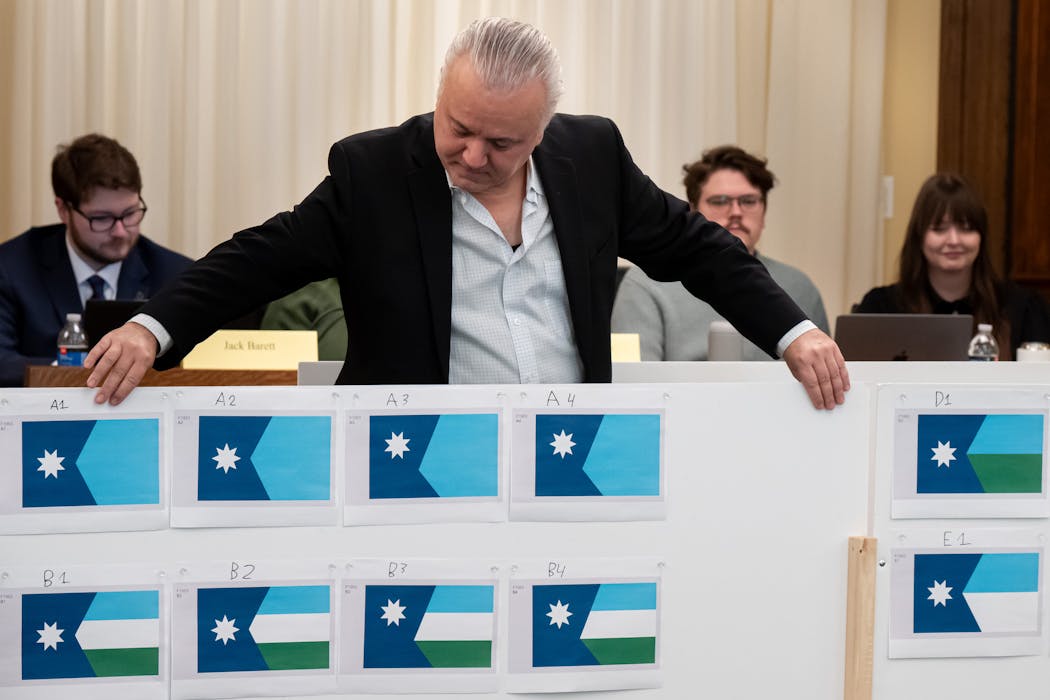
The commission tasked with redesigning the state's emblems landed on a design Tuesday that features the shape of Minnesota, cast in a deep blue and topped with an eight-point star facing north. The stripped-down design also features a solid block of light blue to represent Minnesota's water.
"We needed to focus on one thing to make us different," said the State Emblems Redesign Commission Chair Luis Fitch, who made an impassioned speech in support of the final design, noting that he saw Minnesota's headwaters of the Mississippi River in the solid blue color.
With their final selection, the commission is expected to meet a Jan. 1 deadline set by the Legislature to redesign both the flag and the state's official seal of government. Members had four months and a budget of $35,000 to substantially redesign the symbols representing the state for the first time in more than 100 years.
Not everyone was pleased with the final selection or the process the commission took to get there. Two Republican legislators who served as nonvoting members of the commission plan to introduce legislation to put the final design to a vote of the public, though there are questions about whether that's constitutional.
"This process should have taken a lot longer, we should have taken more public testimony, we should have heard from more Minnesotans," said Rep. Bjorn Olson, R-Fairmont.
The DFL-led House and Senate passed the legislation last session to create a commission to redesign the flag and the seal after decades of criticism that the imagery on both was problematic. The state seal, which is at the center of the flag, shows a white settler plowing a field in the foreground while a Native American man on horseback rides into the sunset.
Flag designers also pushed for a new look, noting Minnesota's busy design looked like more than a dozen other state flags and was hard to decipher from a distance.
The new flag is a simplified version of a concept submitted by Andrew Prekker, a 24-year-old Luverne resident who was one of more than 2,000 Minnesotans who created alternatives for the commission.
Prekker's original design included the state's shape and a white North Star next to a white, green and blue stripe representing the snow, the land and the state's waters. But a majority of commission members favored eliminating the stripes for a simple solid blue color to strip down the design to its simplest form.
"It's going to last, it's going to be recognizable, it's going to be distinct," said Tyler Michaletz, a designer who did pro bono work creating alternatives on the final design concept for the commission.
Commission member Denise Mazone, a representative of the Council for Minnesotans of African Heritage, was the lone member to vote in favor of a flag that maintained the three stripes in the original design.
"The majority of the feedback that I got and that I read, they wanted three stripes, the three different colors," she said. "The green stands for all the land that we walk on. I just want it to be inclusive. It has meaning."
The North Star chosen for the flag mirrors one in the State Capitol rotunda and is similar to a star included in another flag finalists' design. The commission debated whether to make the K shape asymmetrical like the state's actual borders, but chose a symmetrical design.
Designers and commission members consulted on the final options with members of the North American Vexillological Association, which rates state flags. They gave Minnesota's longstanding state flag an F. The new flag is considered by vexillologists to be among the best state designs in the country, commission members said.
"We have vaulted from an F to an A-plus," said commission vice chair Anita Gaul, a college history professor from southern Minnesota. "As a teacher that just got done grading a bunch of final exams, that's almost impossible to do."
The final design selected Tuesday is the culmination of months of research and public meetings. The public, eager to engage in the process, submitted more than 20,000 comments on a handful of flag and state seal finalists last month and have been flooding commission members with emails.
Members said the negativity on social media has been one of the most challenging aspects of the process, but they're hopeful the design will connect with Minnesotans over time. They've frequently cited the outcry that occurred after Canada redesigned its flag in the 1960s. Now the simple maple leaf design is one of the most recognizable worldwide.
"Change is hard initially, but then you get used to it," said Gaul. "By the time my kids are adults, they will embrace this flag; they will hardly remember the one we had before it."
The commission also adopted a new seal design that features a red-eyed loon on a Minnesota lake surrounded by pine trees, the North Star and sprigs of wild rice. Above the image are the words: "Mni Sóta Makoc̣e," Dakota for the "land where the waters reflect the sky."
Unless the Legislature takes action, the new flag will start flying May 11, which is Statehood Day.
Former DFL Senate Majority Leader Kari Dziedzic dies of cancer at age 62

How the Star Tribune is covering the 2024 election

Fact check: Walz and Vance made questionable claims during only VP debate

In Tim Walz's home city, opposing groups watch him debate on the national stage


